About the project
Exploring a fashion collection on mobile often feels more mechanical than it should be. You scroll, filter, compare, but the process rarely reflects how people actually relate to clothing.
This project started from that gap.Instead of focusing only on visual redesign, the direction was to rethink how a digital experience could feel more personal, intuitive, and aligned with the way people perceive fit, proportion, and style.
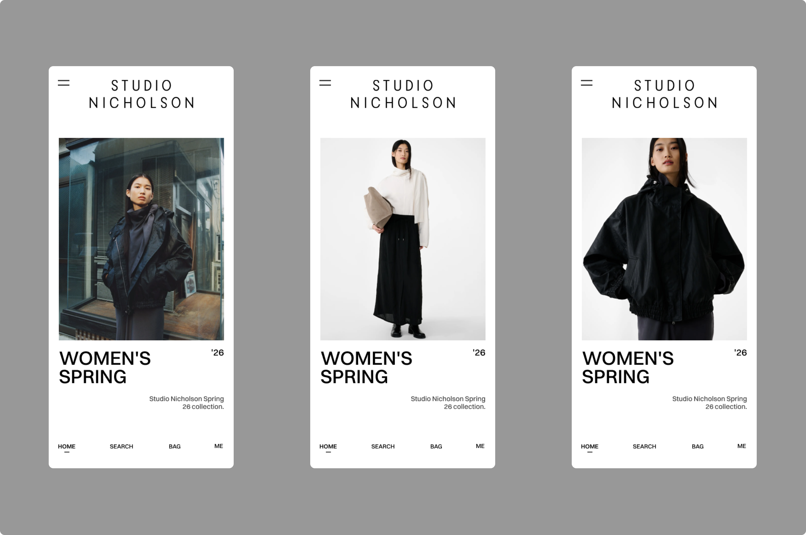
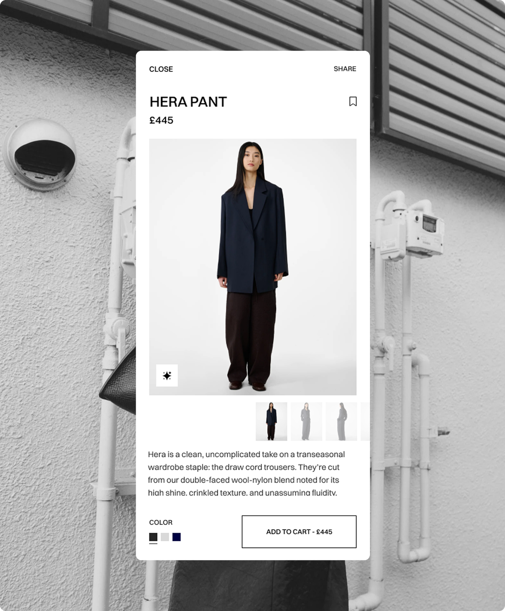
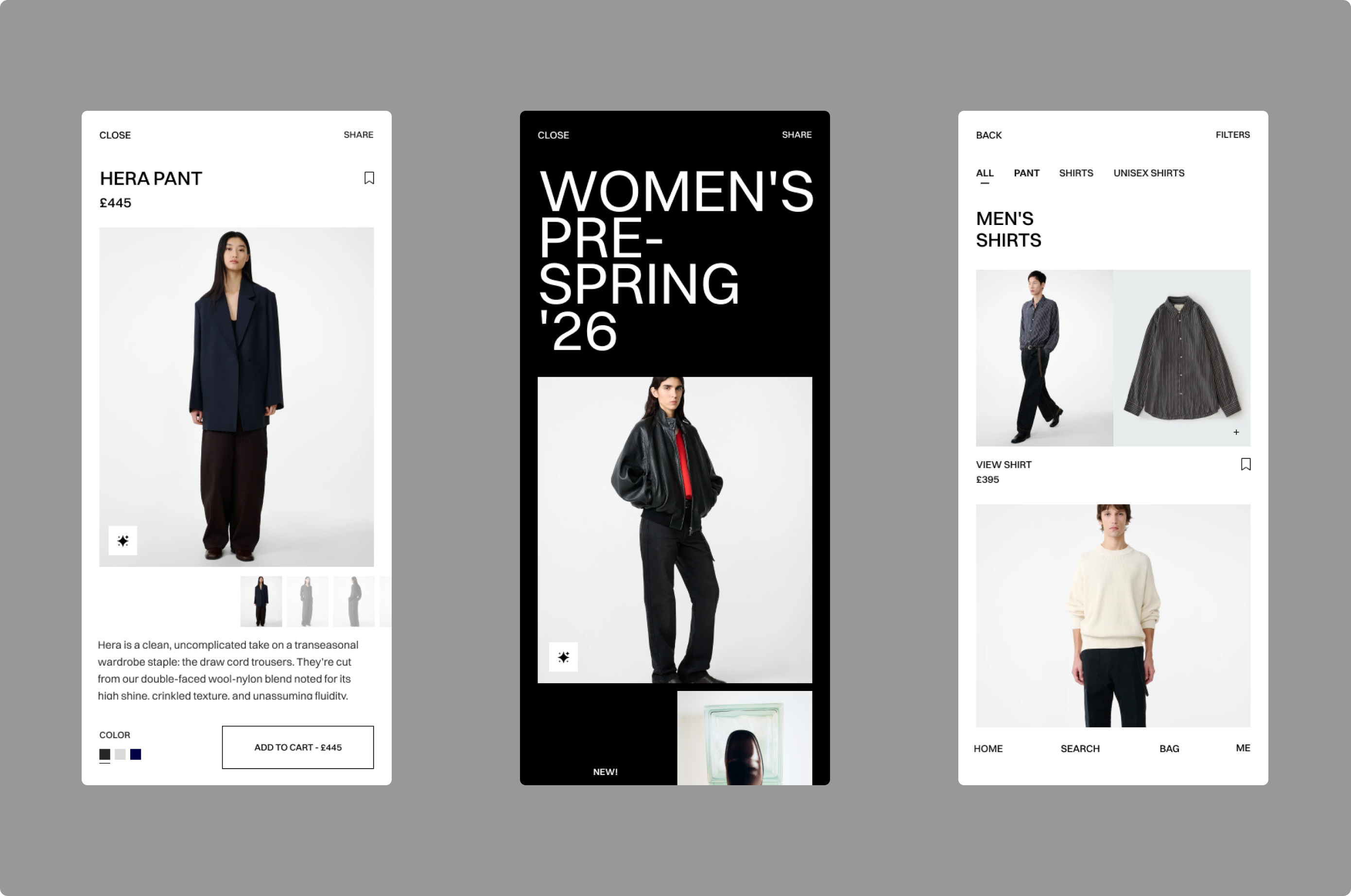
The app shifts the focus from navigation to interaction. Rather than exposing everything at once, the experience guides users through a calmer journey, where each step feels intentional and easy to follow.
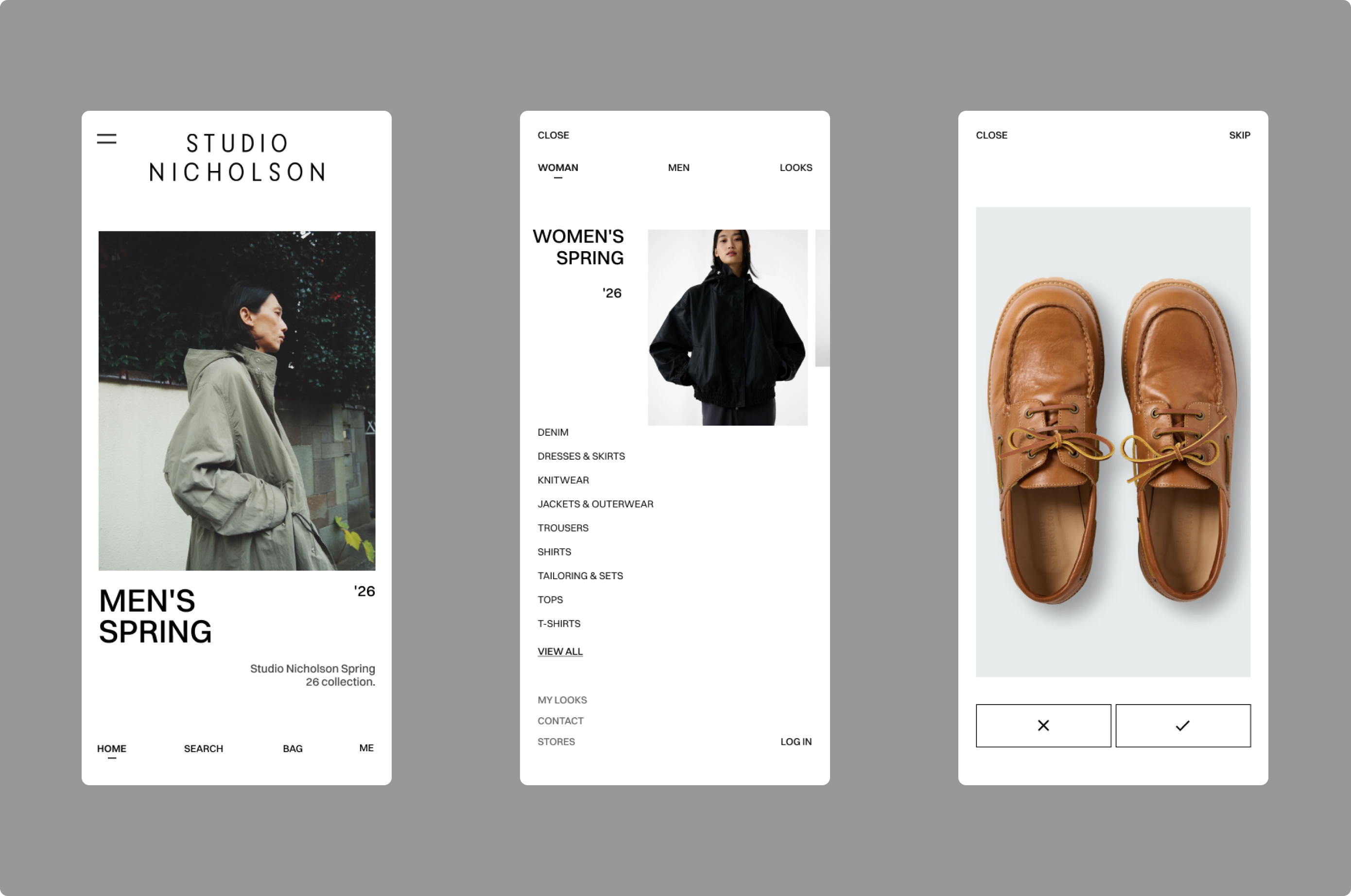
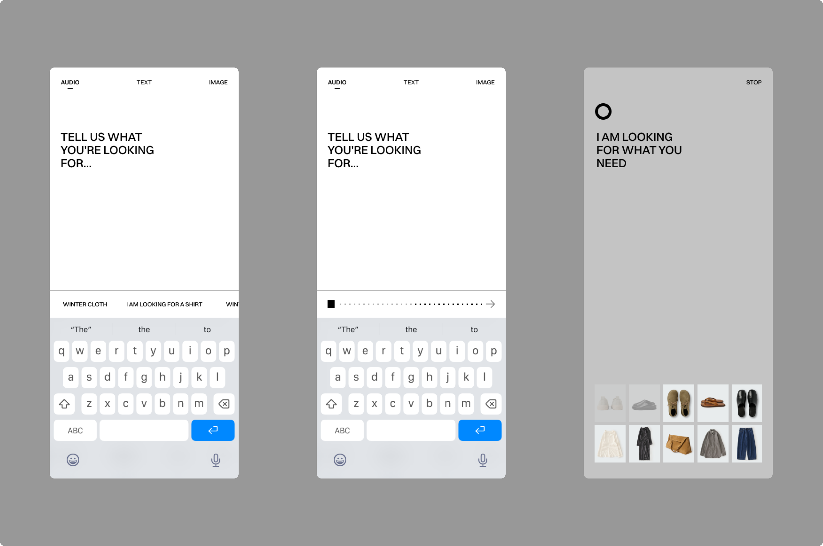
The interface reduces noise and highlights what matters in each moment.Key features were introduced to change how decisions happen. Taste-based interactions gradually shape the experience over time, making discovery more relevant and personal. Voice search brings a more natural way to explore the collection, removing the need for rigid filters.
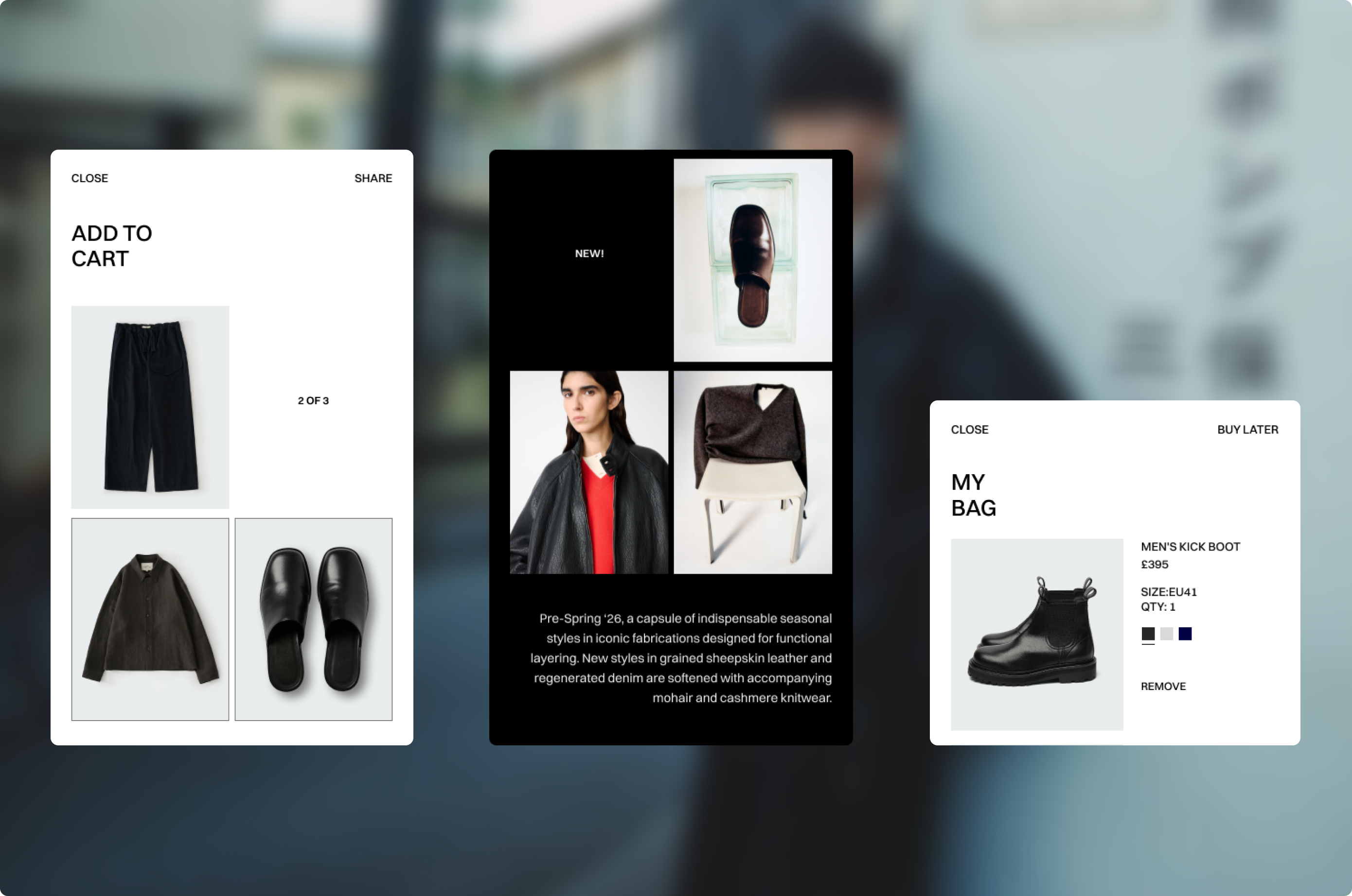
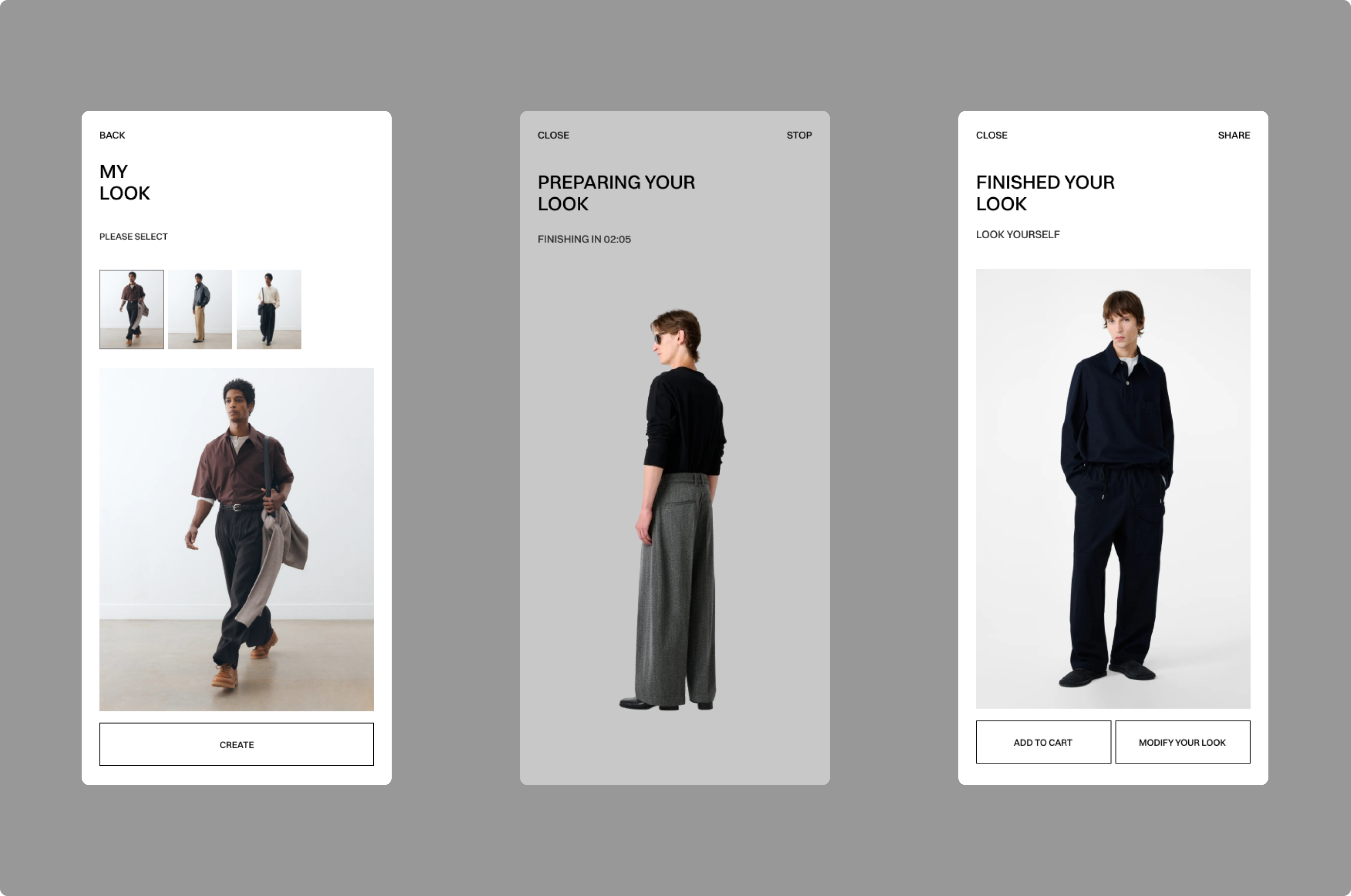
My Look extends the experience further by allowing users to use the camera to bring garments into their own context. The focus is not on simulation, but on understanding fit, proportion, and presence.The system adapts quietly, learning from interactions and refining what is shown, without interrupting the flow.
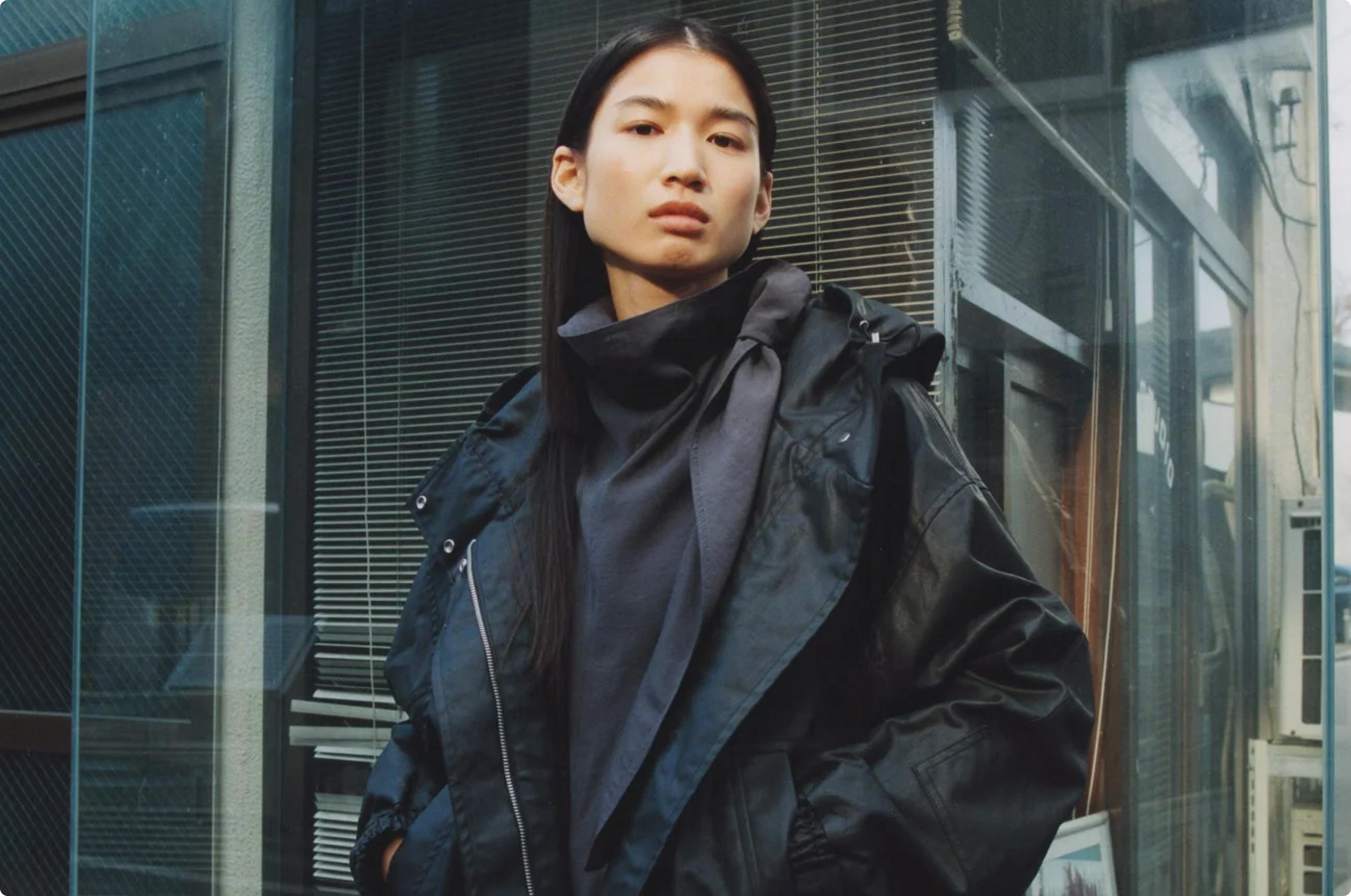
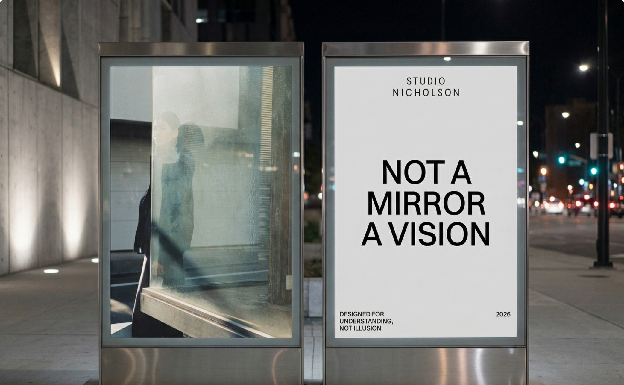
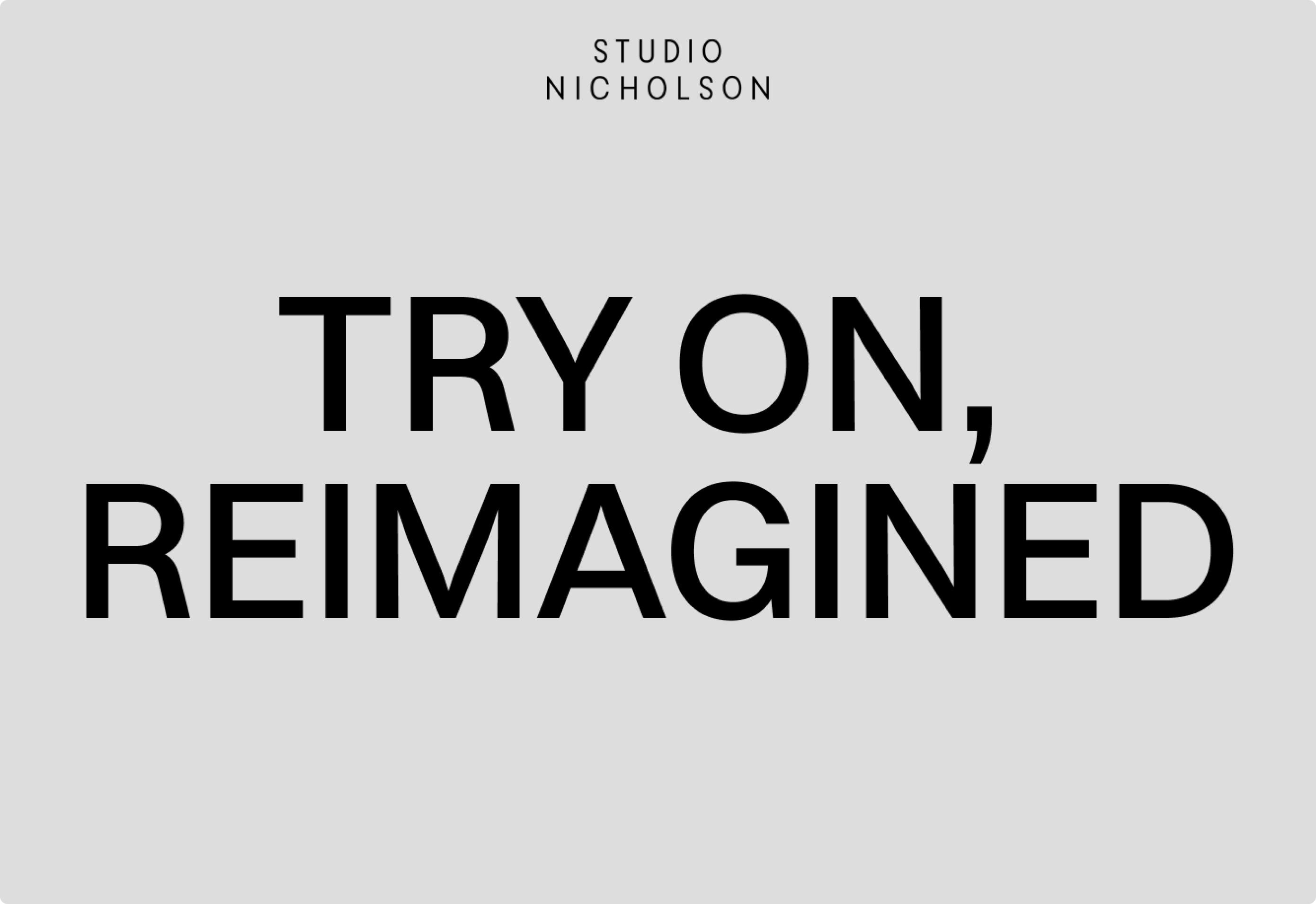
Alongside the product, a series of print pieces was designed to introduce the concept in a more editorial way. The visual direction follows a minimal approach, using bold typography and restrained compositions to communicate the idea with clarity.
More than a digital product, this project explores how fashion can be experienced in a way that feels closer to instinct than to process. The result is a more fluid and confident way to explore and choose garments.