About the project
Cars are often introduced through experiences that prioritize features over feeling. What should be a moment of connection with the product becomes a sequence of information, options, and decisions that rarely reflect the essence of the brand.
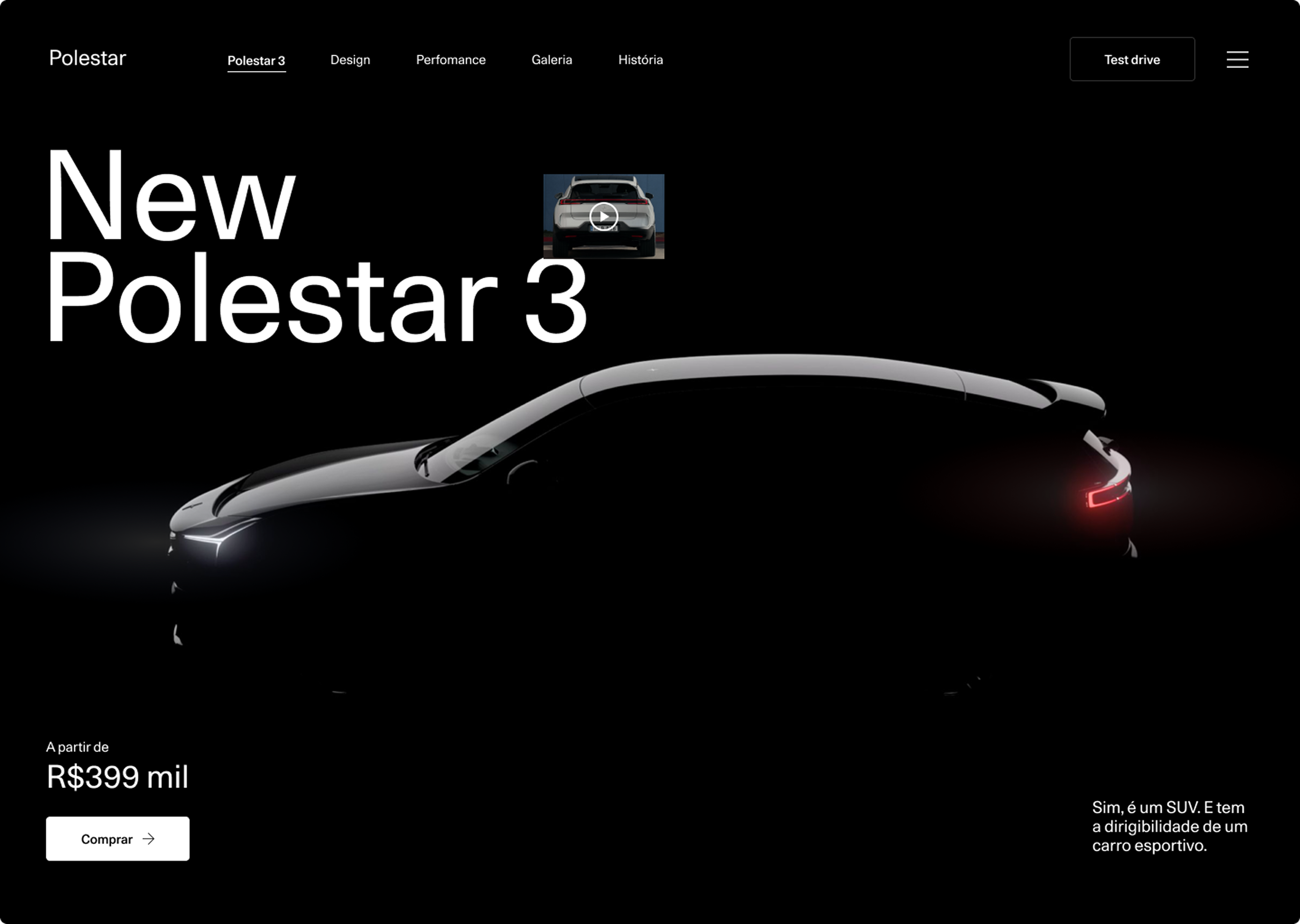
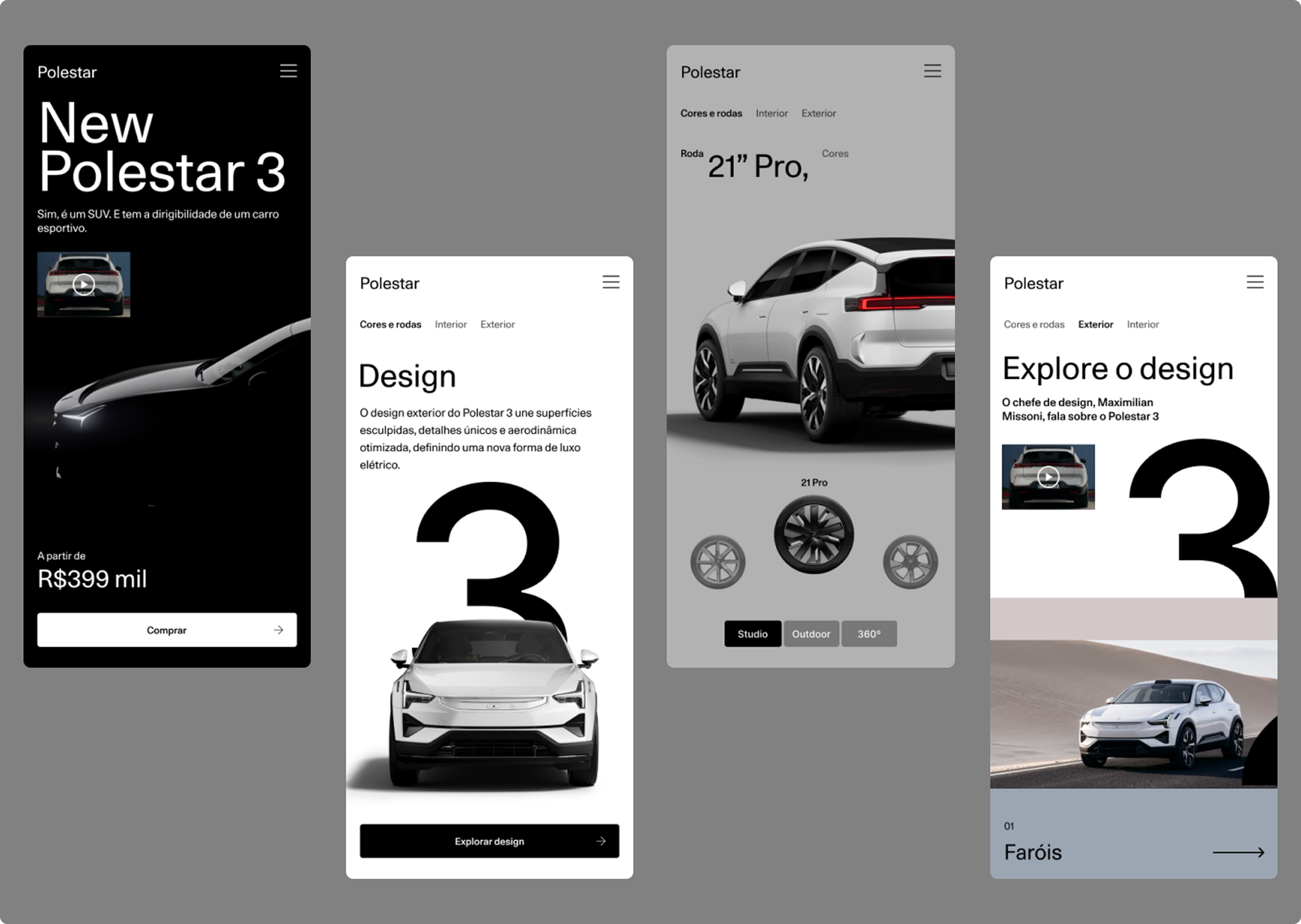
This project started from that gap.Instead of creating a conventional automotive website, the goal was to translate what Polestar 3 represents into a digital experience. Not just as a vehicle, but as an expression of precision, performance, and sustainability.
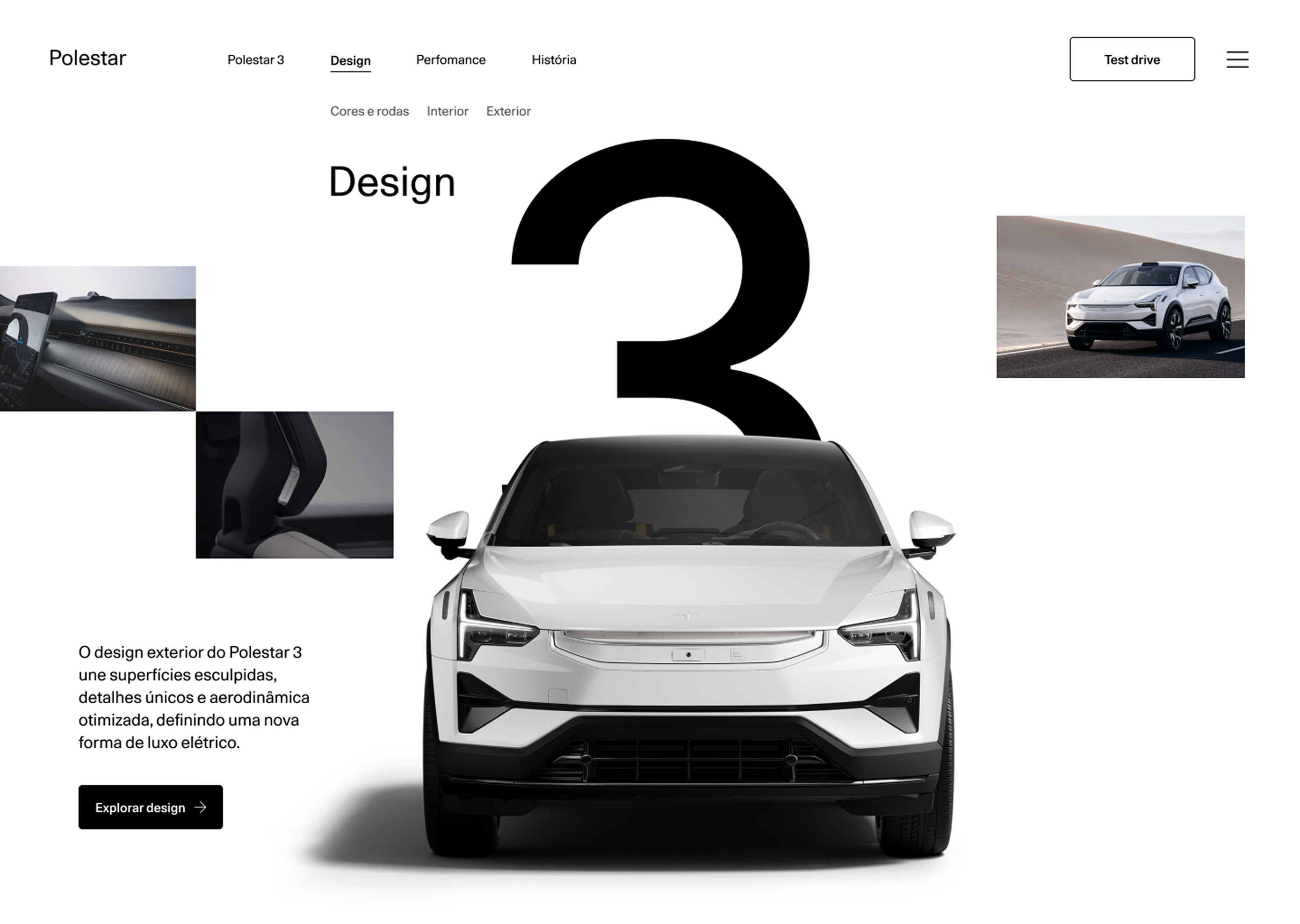
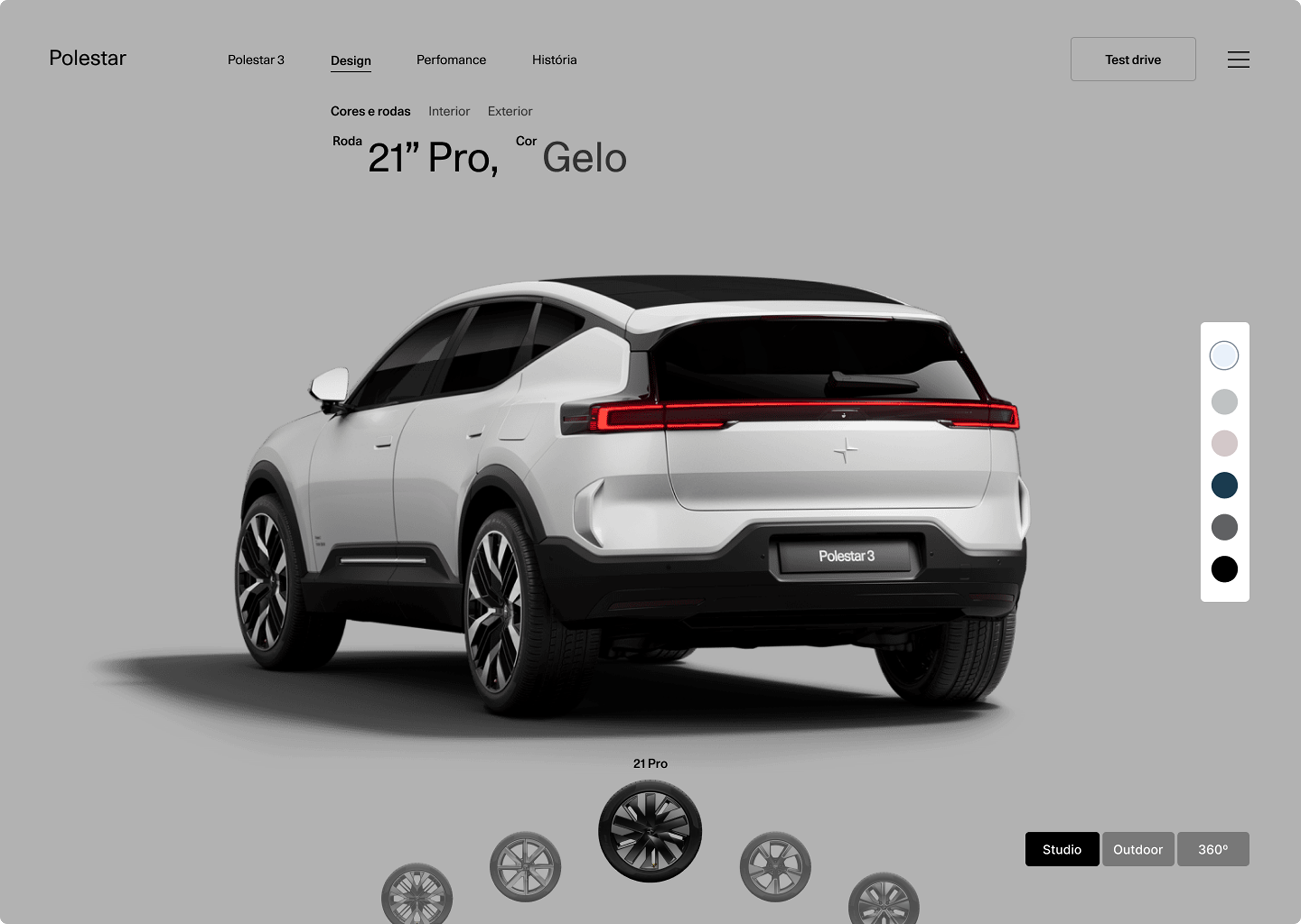
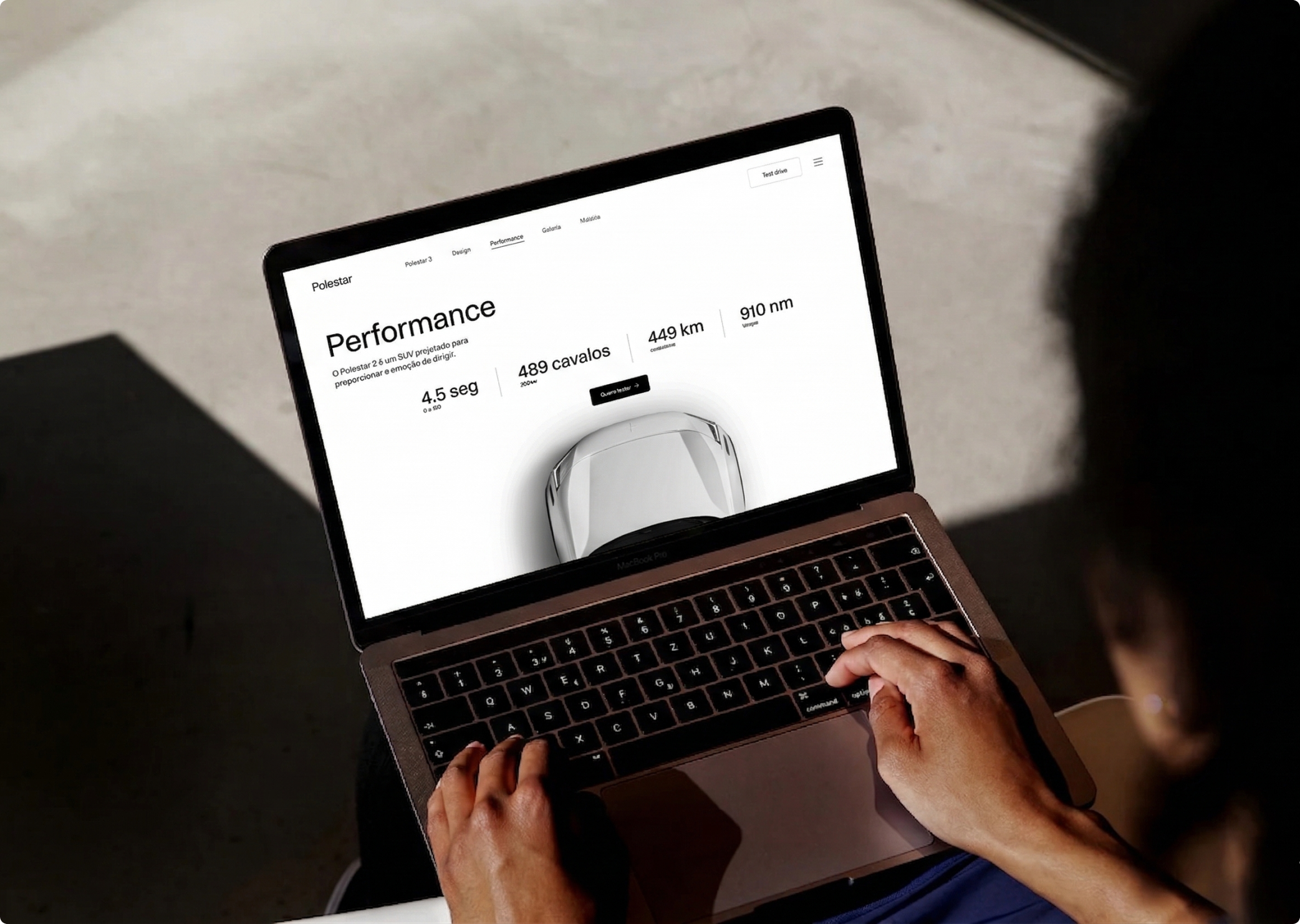
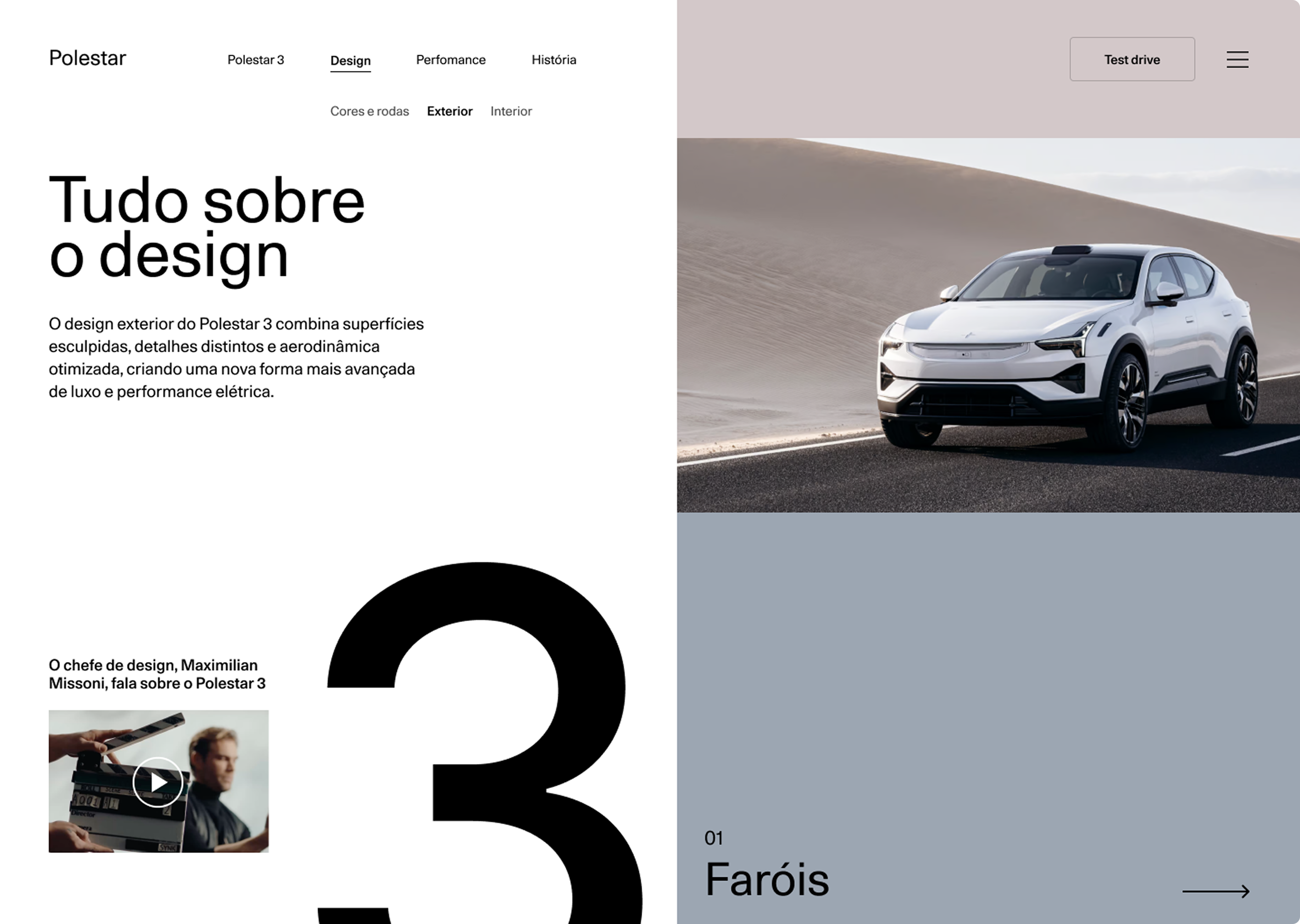
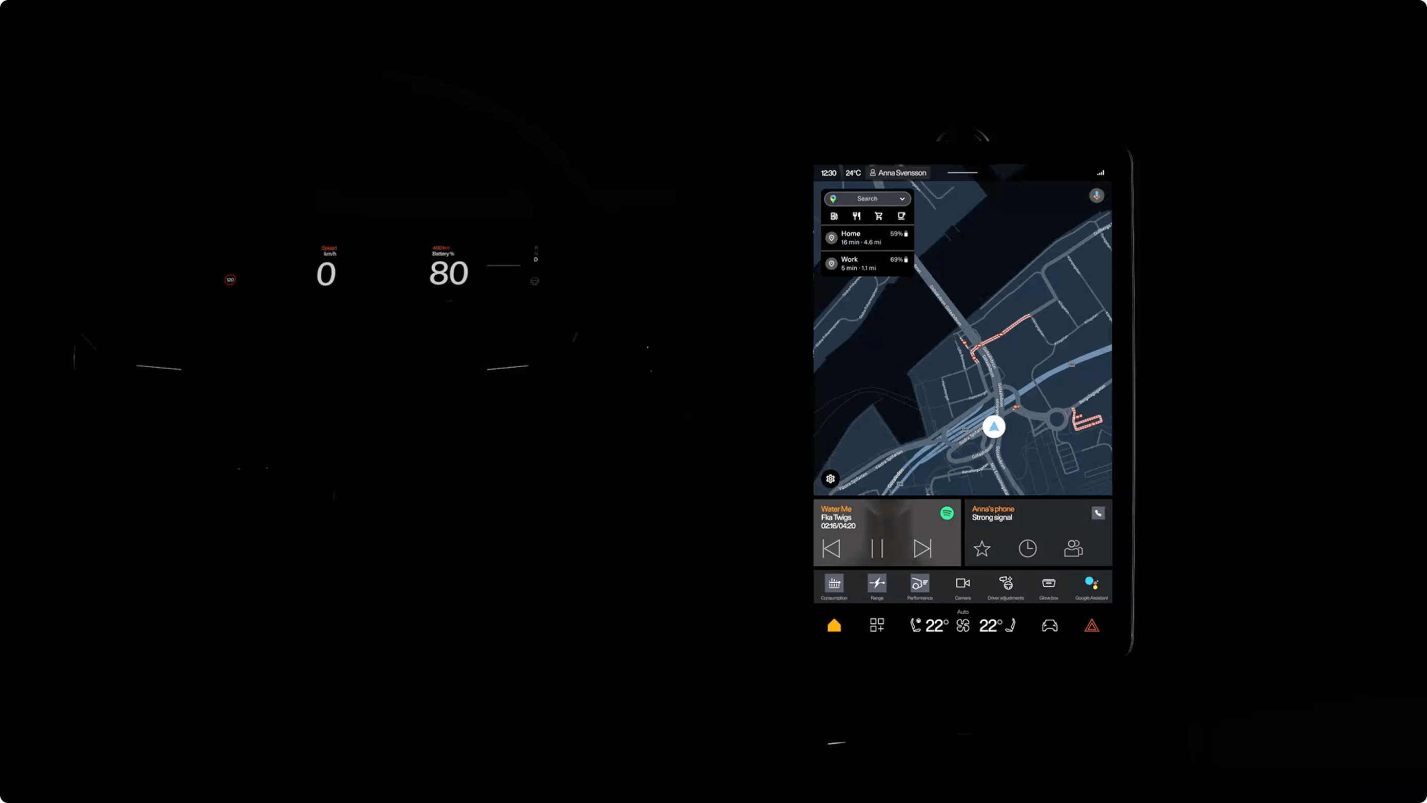
The design shifts the focus from excess to intention. Every element was reduced to its necessary form, allowing the content and the product to lead the experience. Navigation flows naturally, without friction, guiding the user through a journey that feels both calm and controlled.Rather than overwhelming with specifications, the experience reveals information progressively.
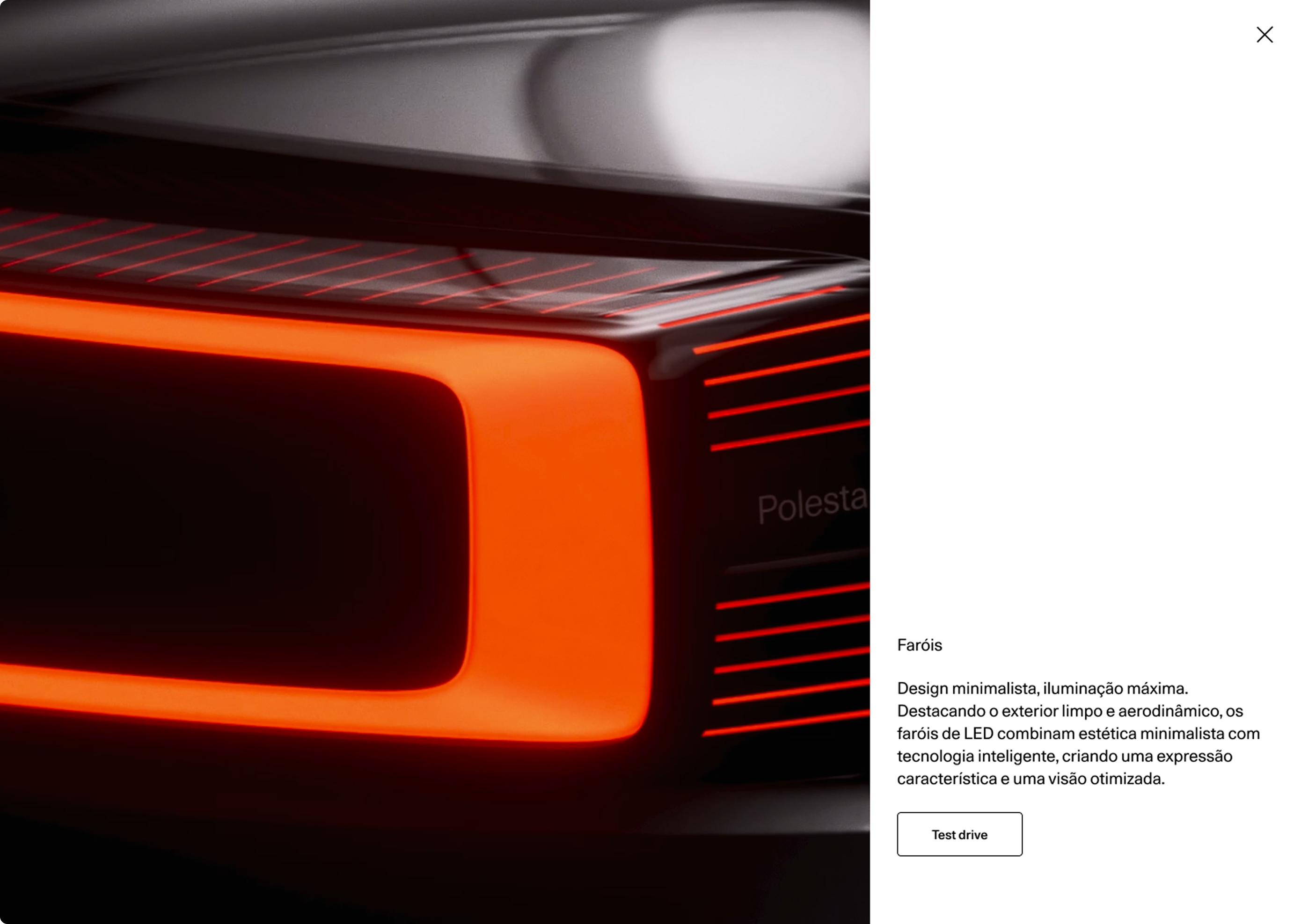
Key features are introduced in context, supported by subtle interactions that reinforce a sense of refinement and technological clarity.The interface doesn’t try to impress through complexity. It builds confidence through consistency, rhythm, and precision.
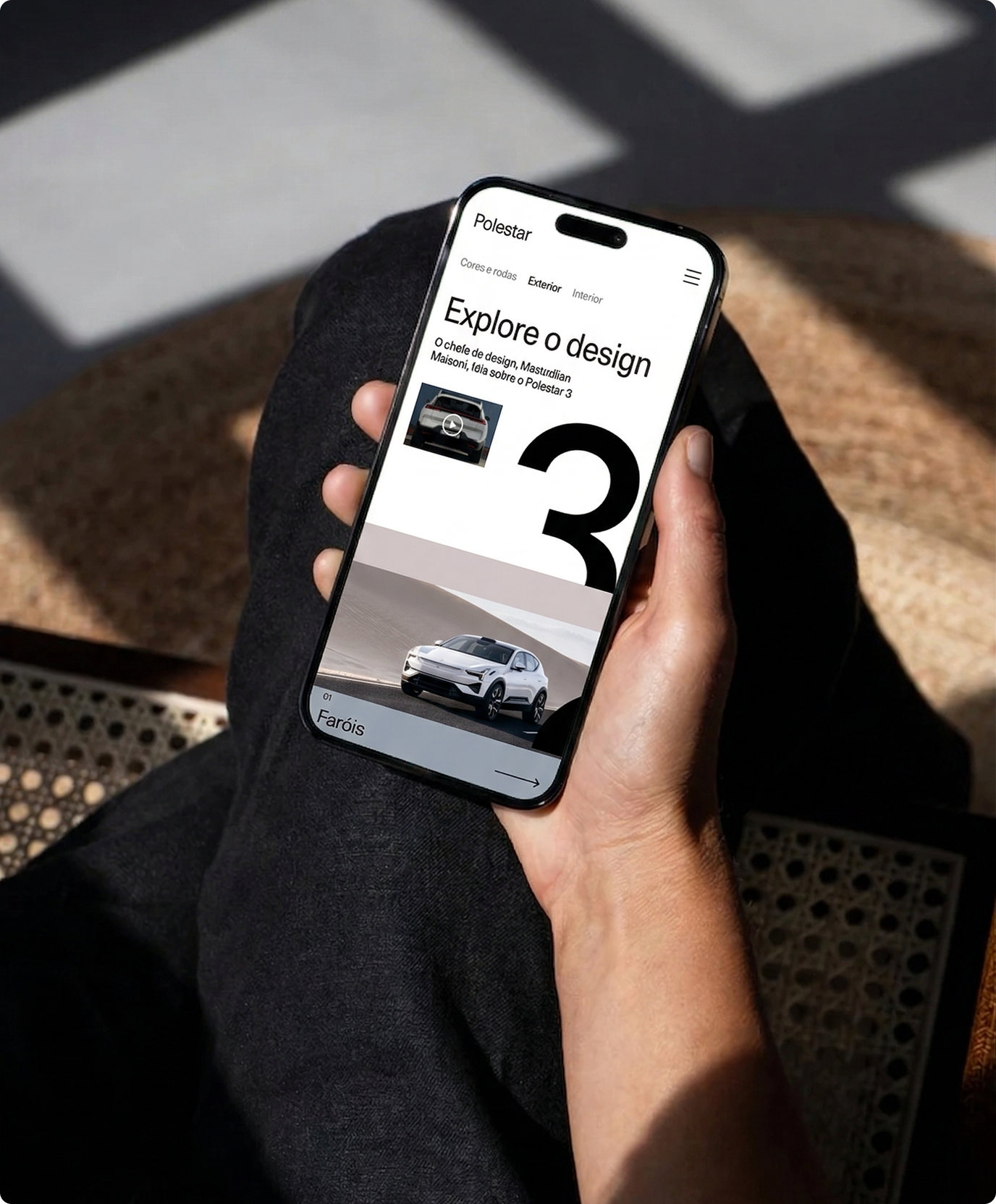
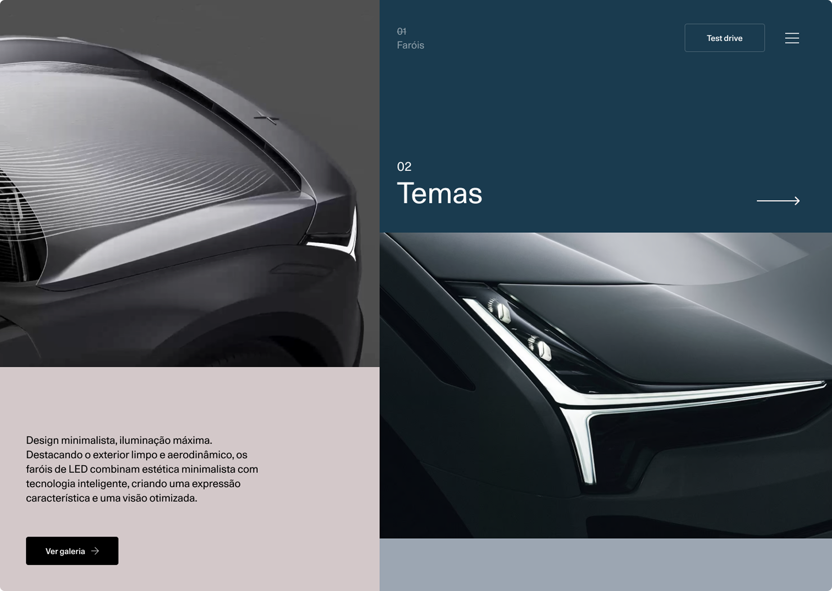
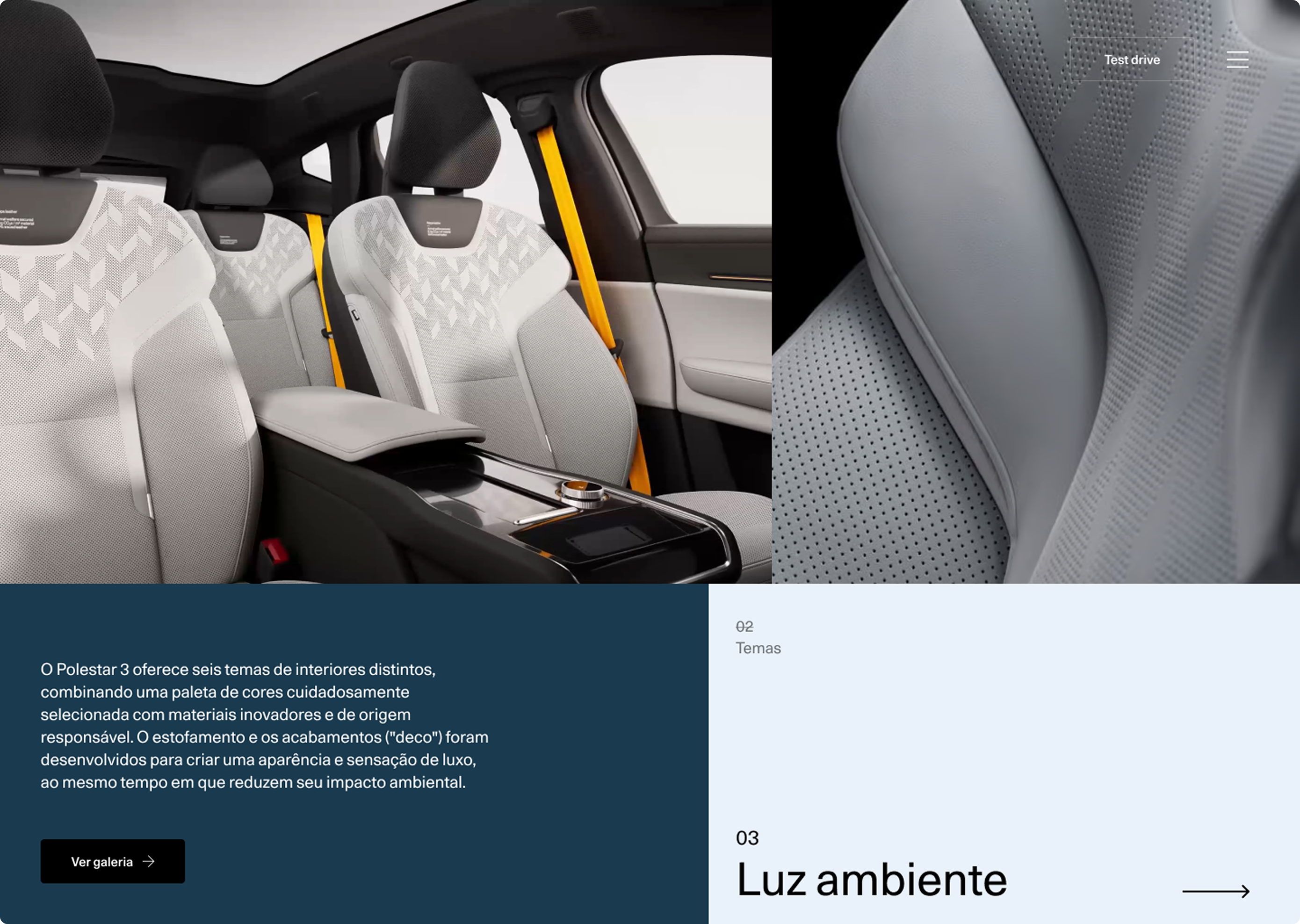
Alongside the digital design, careful attention was given to how the brand’s visual language translates across screens. Typography, spacing, and motion were treated as integral parts of the experience, ensuring alignment with Polestar’s premium identity.The system doesn’t try to do more. It focuses on doing what matters, with clarity and purpose.
More than a website, this project explores how a digital environment can reflect the same values embedded in the product itself. The result is an experience that feels aligned, immersive, and distinctly Polestar.