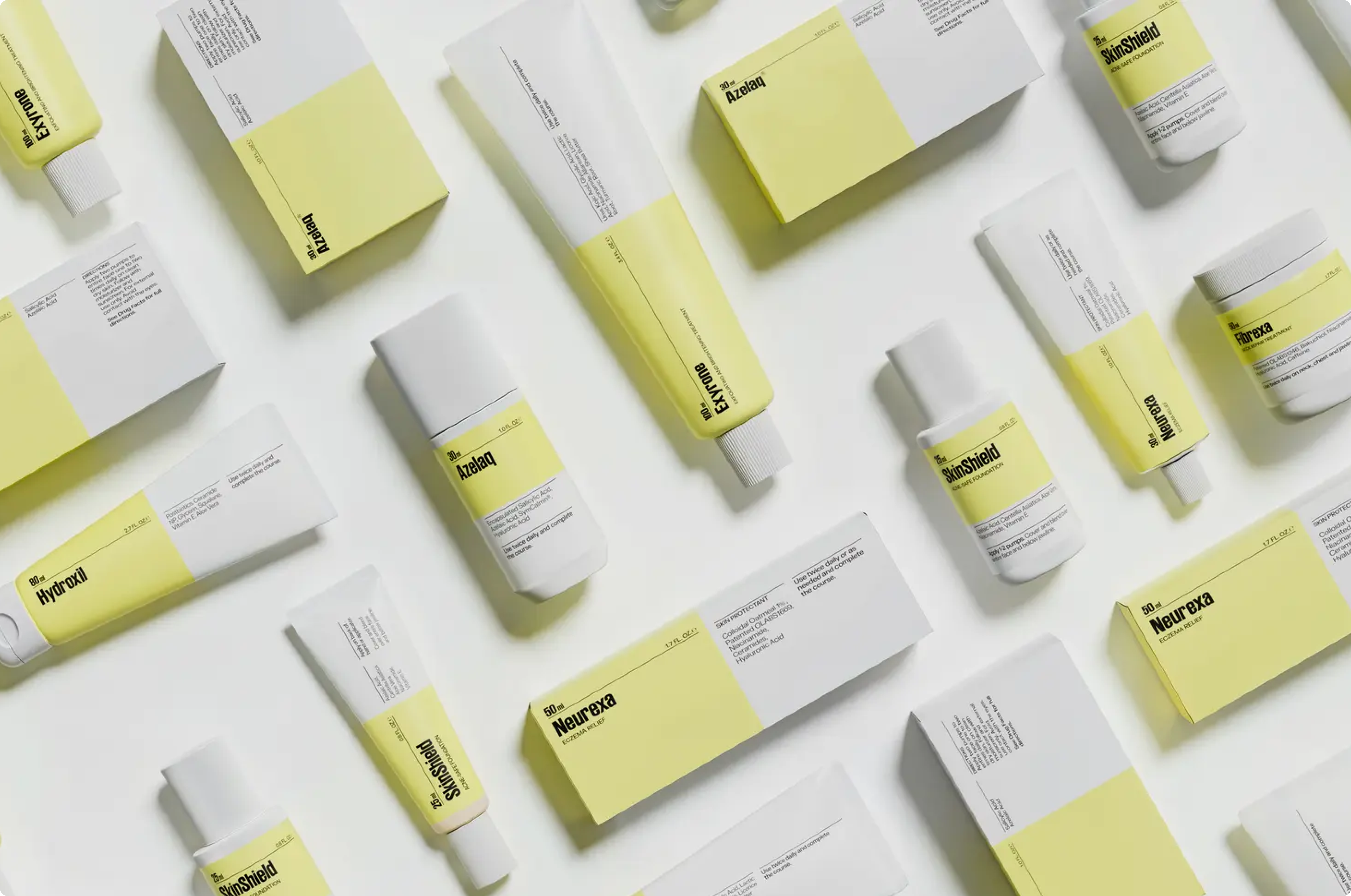
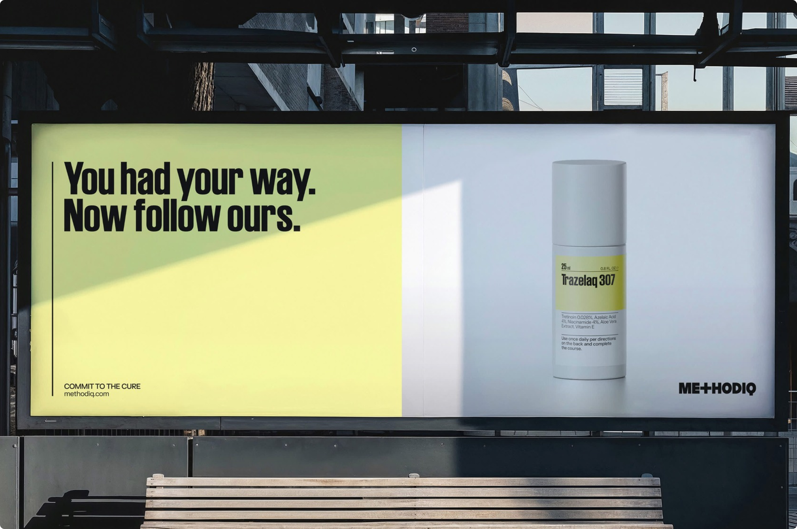
About the project
Complex digital products often grow around structure, but not always around clarity. As features expand and workflows become more layered, the experience can start to feel fragmented, requiring more effort than necessary to navigate and understand.
This project started from that gap.I was invited by Diego Araujo, Executive Design Director at Oddity NY, to rethink the METHODIQ experience.
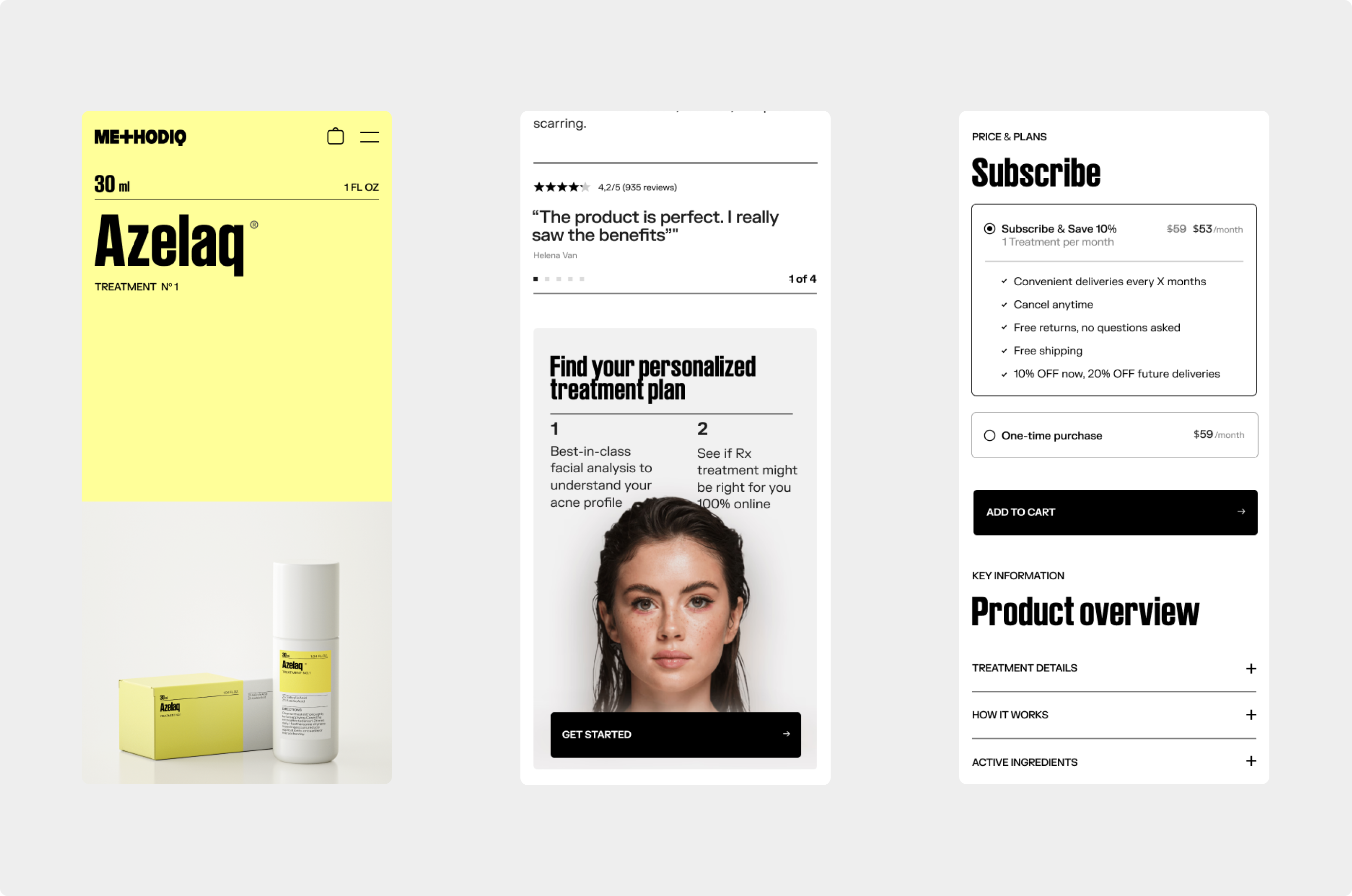
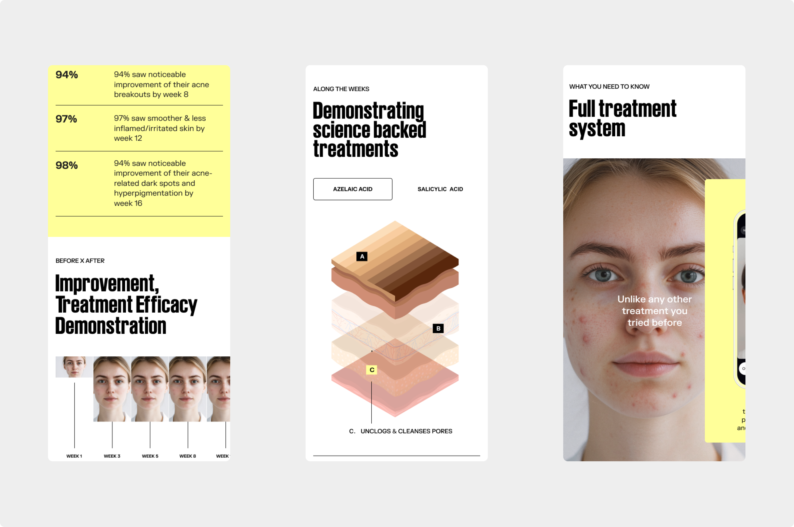
From the beginning, the goal was not just to redesign the interface, but to bring consistency and intention to how the product behaves across different contexts.Instead of adapting an existing structure, the experience was rebuilt from a responsive-first approach.
Starting from mobile allowed the design to focus on what truly matters, defining hierarchy, interactions and content with precision before expanding to larger screens.The system shifts from scattered interactions to a more structured and predictable flow.
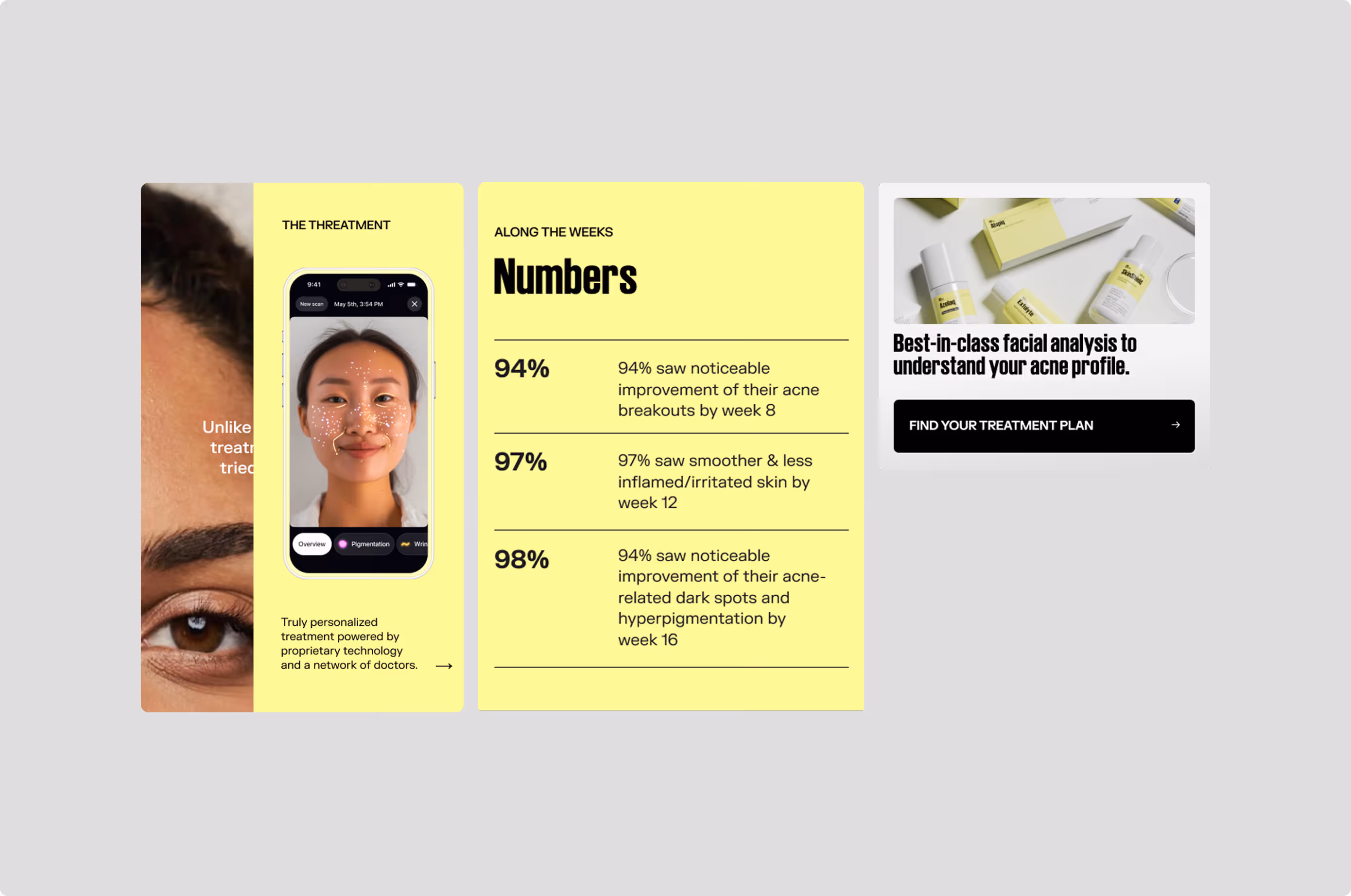
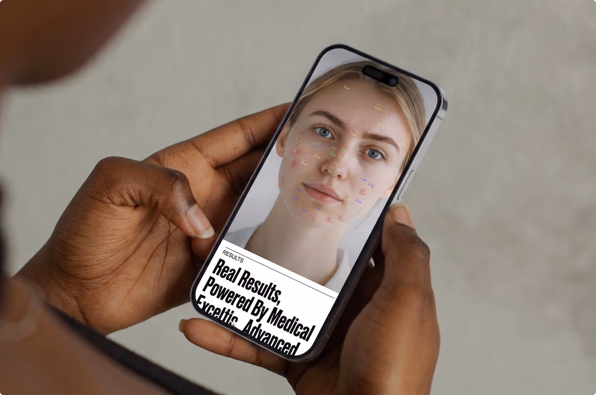
Information is introduced progressively, guiding users through each step without overwhelming them. What was once complex becomes something easier to read, navigate and act on.The interface was designed to support this behavior with clarity and restraint.
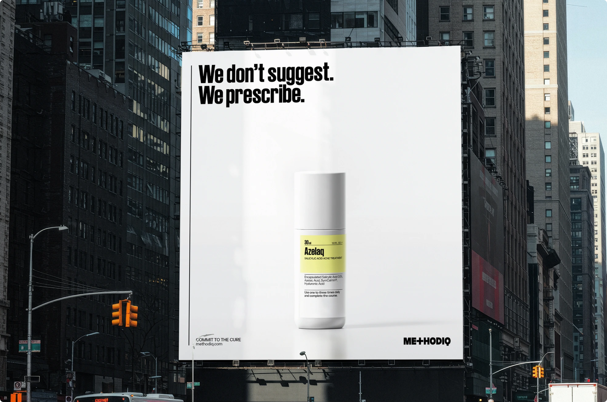
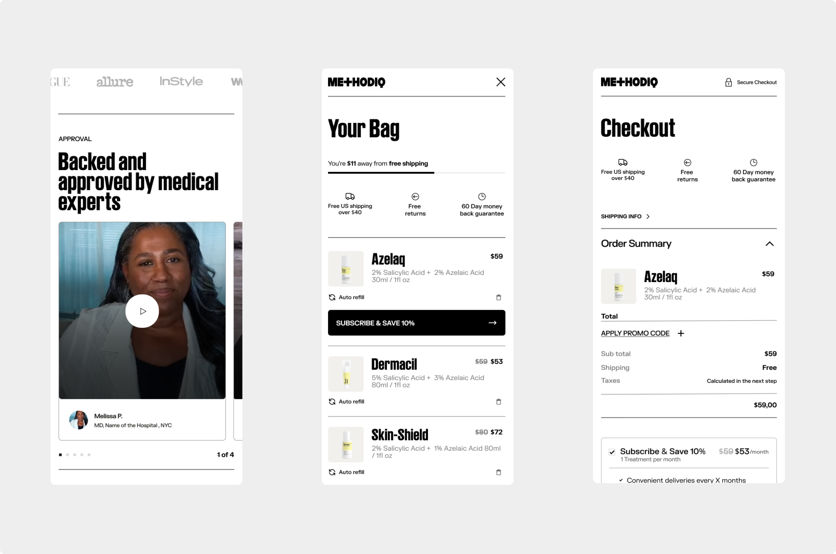
Clean layouts, balanced spacing and a strong visual hierarchy create a sense of control, while interaction patterns reinforce consistency across the entire product.Rather than exposing everything at once, the experience reveals content through context.
Each screen has a clear role, helping users stay focused and move forward with confidence.Working closely with Diego throughout the project was a rich and meaningful experience. His perspective, rigor and support played a key role in shaping the outcome, making the process as valuable as the result itself.
More than a redesign, this project establishes a scalable foundation for METHODIQ, where structure and clarity work together to support better decisions and a more refined product experience.