About the project
Companies in the digital certification space often operate within complex systems, where technical requirements shape the experience more than the user itself. As a result, purchasing flows tend to feel rigid, repetitive and difficult to navigate.This project started from that gap.
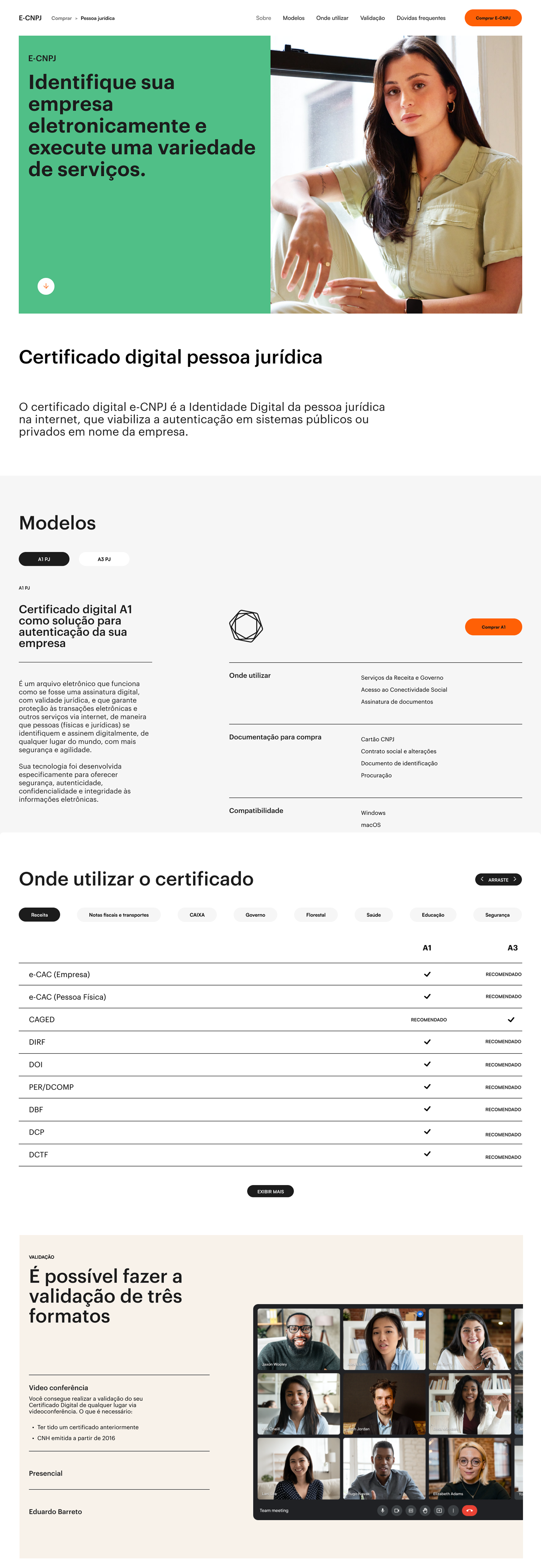
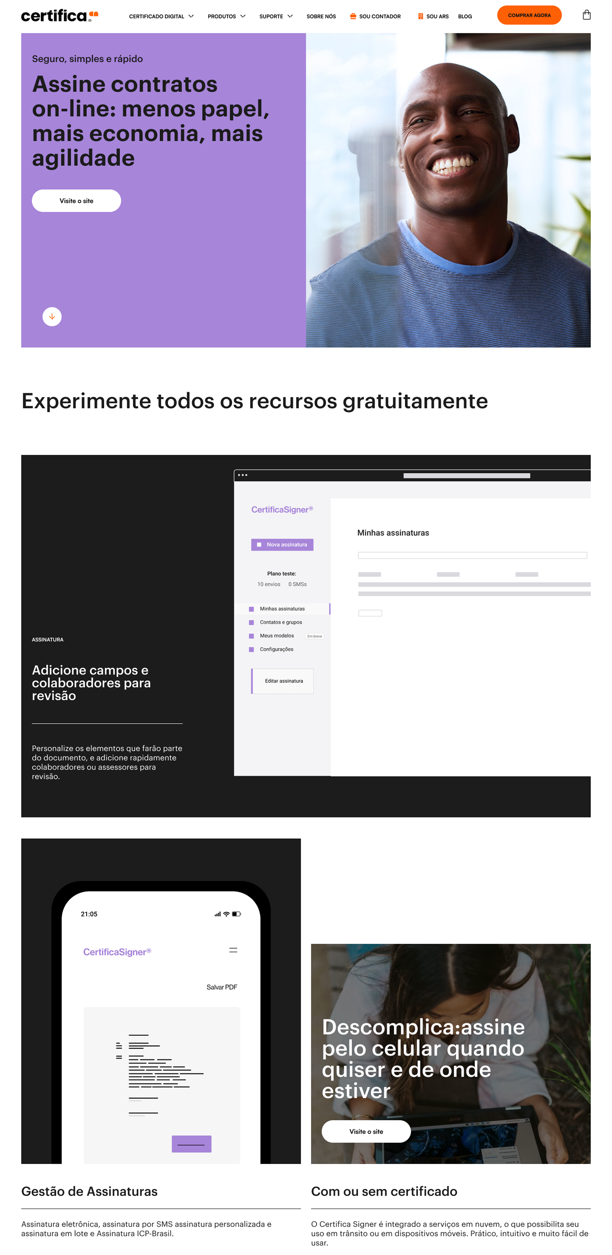
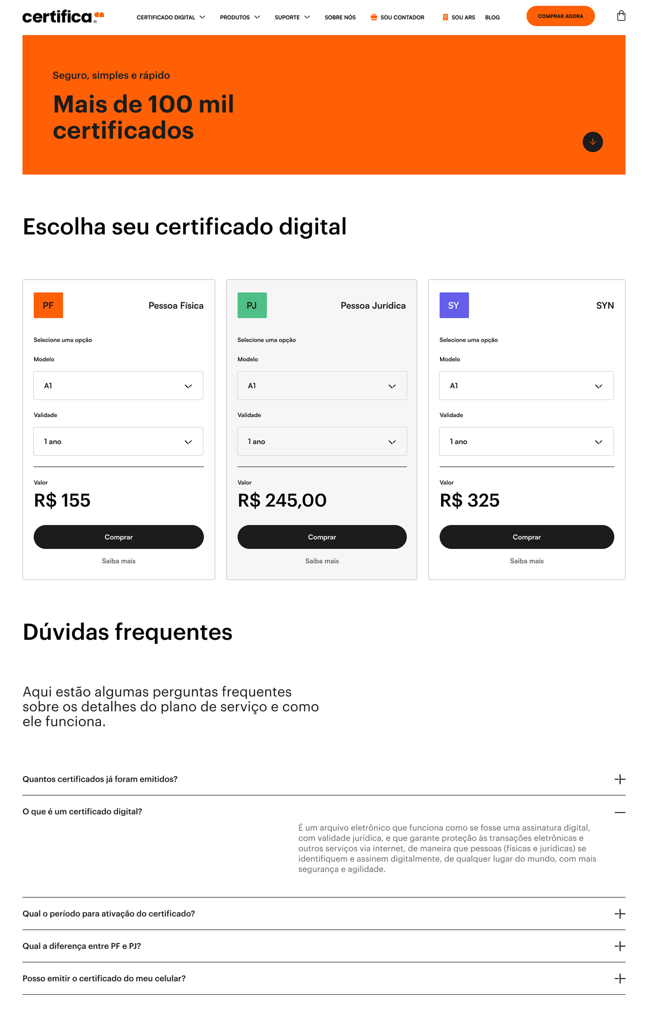
Following a full rebranding, I was selected to design and launch the new website for Certifica, one of the leading references in digital certification in Brazil. The challenge was not only to implement the new visual direction, but to rethink how users interact with a highly technical product.Instead of replicating the standard flows used across the market, I looked for a model that could simplify decision-making without losing depth.
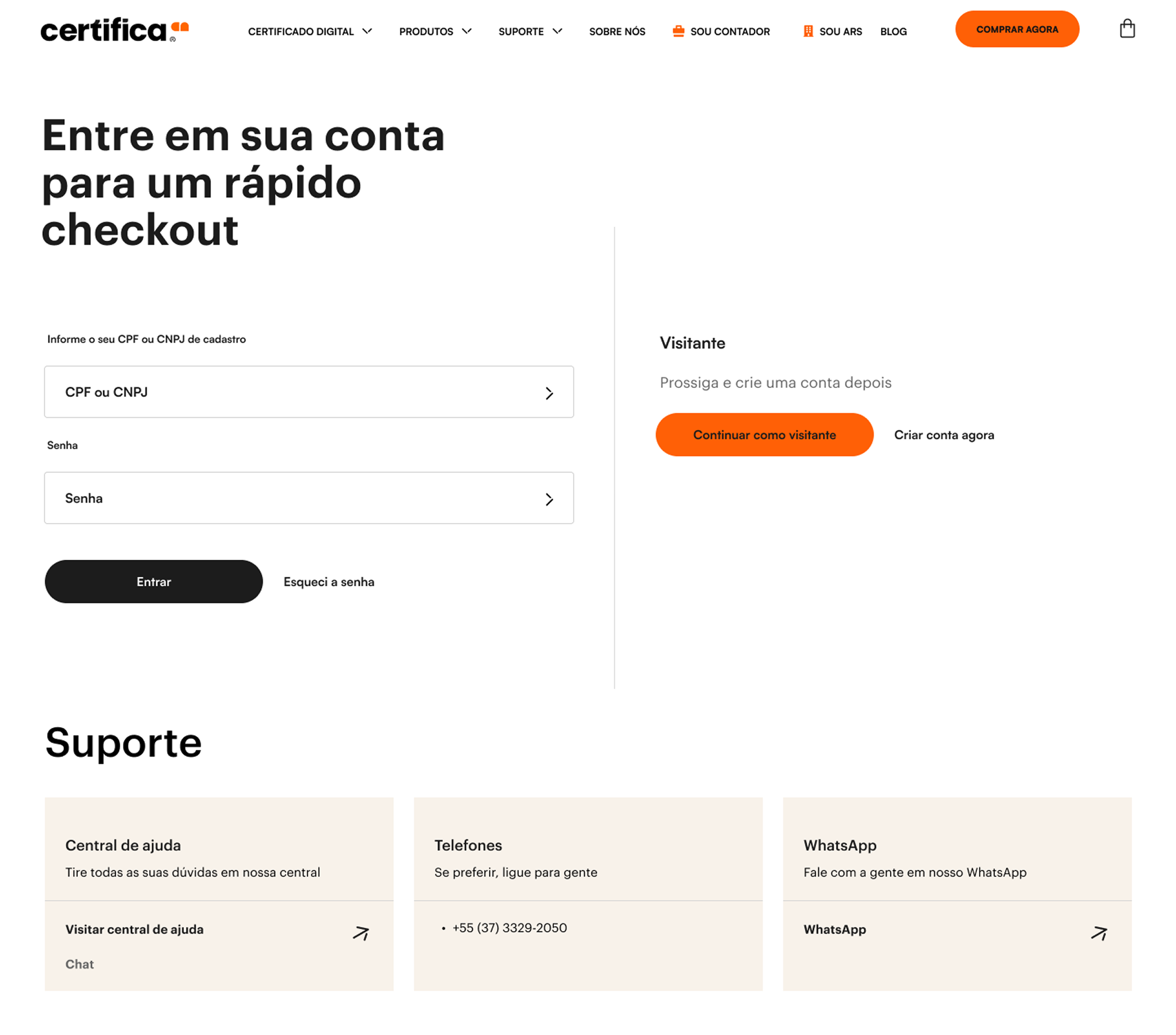
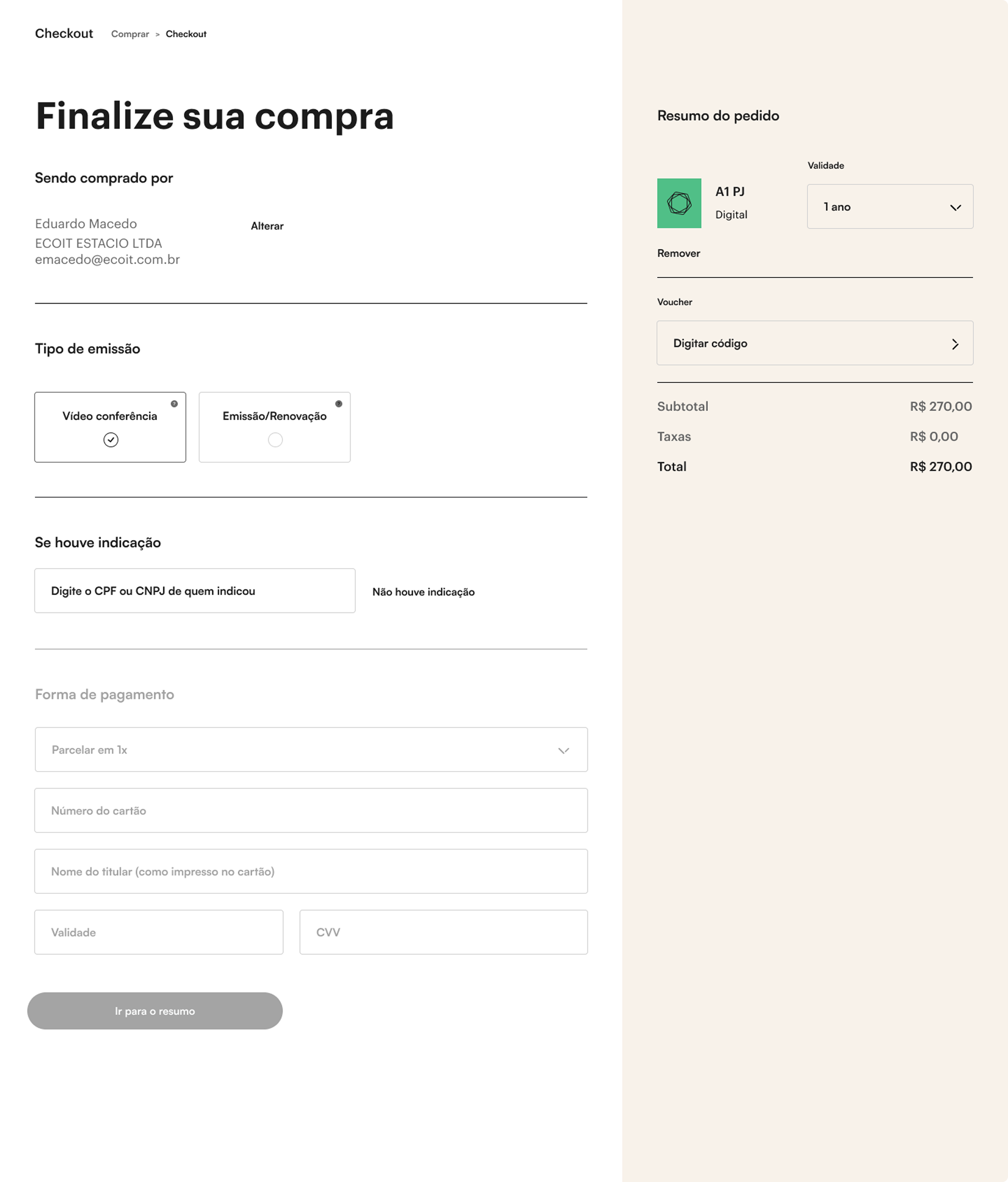
The purchase experience was inspired by Apple's flow, adapted to fit the specific context of digital certificates.The system shifts from a fragmented process to a more guided and intuitive journey. Each step was designed to clarify choices, surface essential information and reduce friction throughout. Complex requirements are introduced progressively, making the experience easier to understand and complete, even for users unfamiliar with the certification process.The interface was built with clarity and restraint.
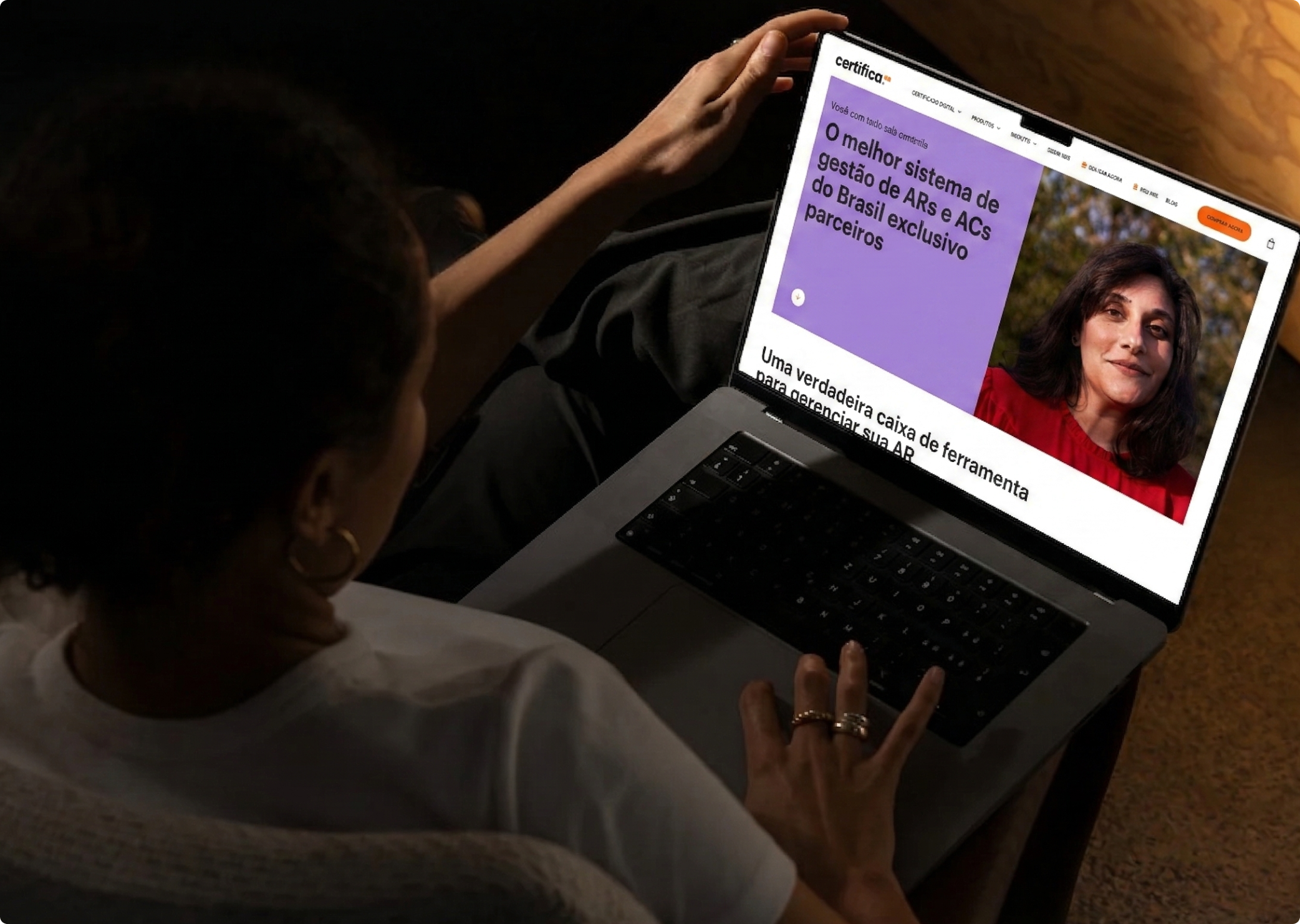
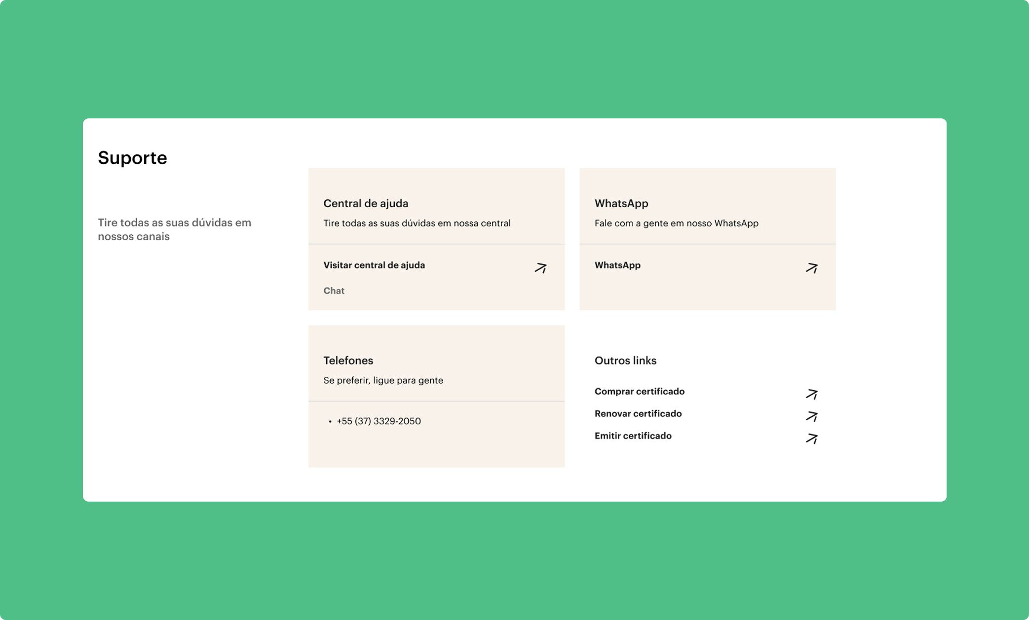
Clean layouts, reduced visual noise and a strong hierarchy keep users focused, while responsive behavior ensures consistency across devices.More than a redesign, this project redefines how digital certification can be experienced, transforming a traditionally bureaucratic process into something clearer, smoother and more aligned with user expectations.


.png)