About the project
Ordering at a fast-food restaurant should be immediate. You walk in, you’re hungry, and you just want to get your food without overthinking. In reality, that moment is often slower than it should be. Too many options, unclear paths, and a flow that doesn’t match how people actually decide.
This project started from that gap.
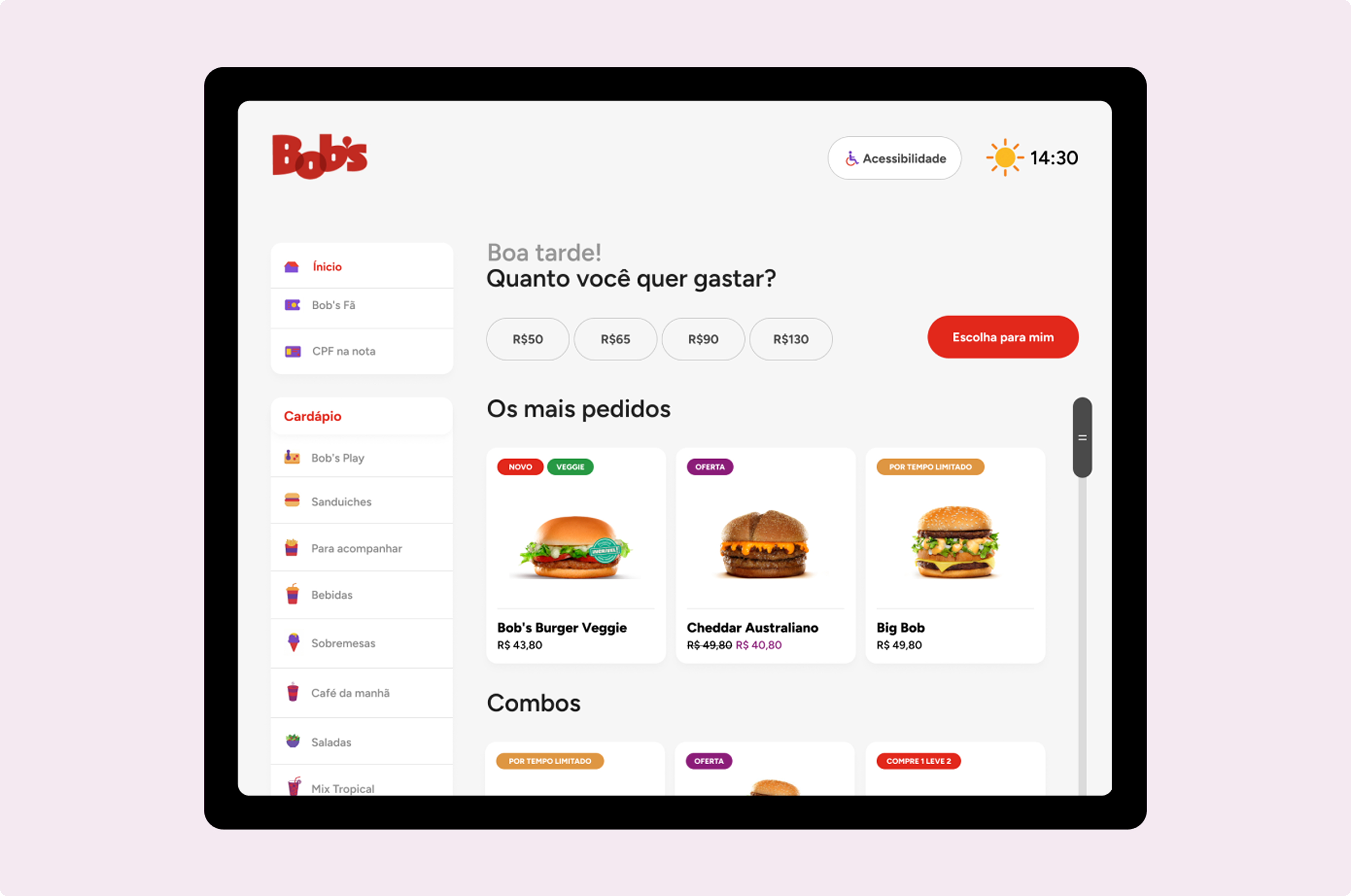
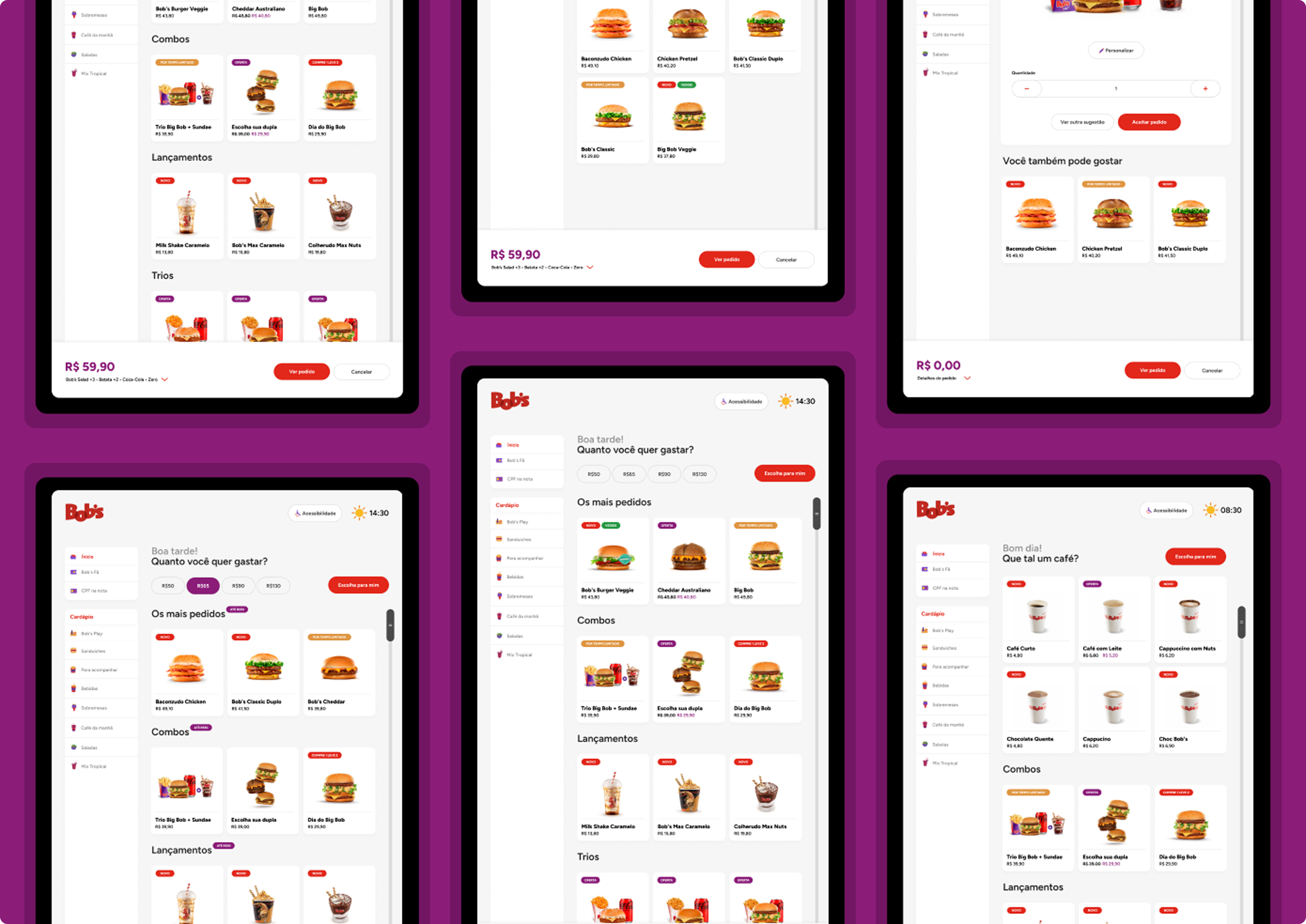
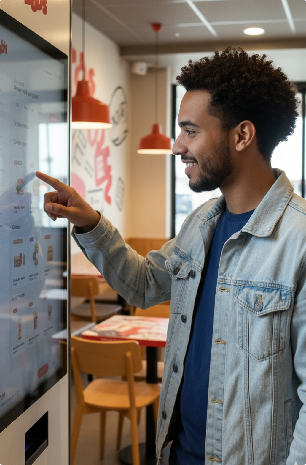
Instead of just redesigning screens, the focus was to rethink the ordering experience inside the restaurant. The Bob’s totem becomes the main touchpoint, designed to reduce friction, guide decisions, and adapt to different users without adding complexity.
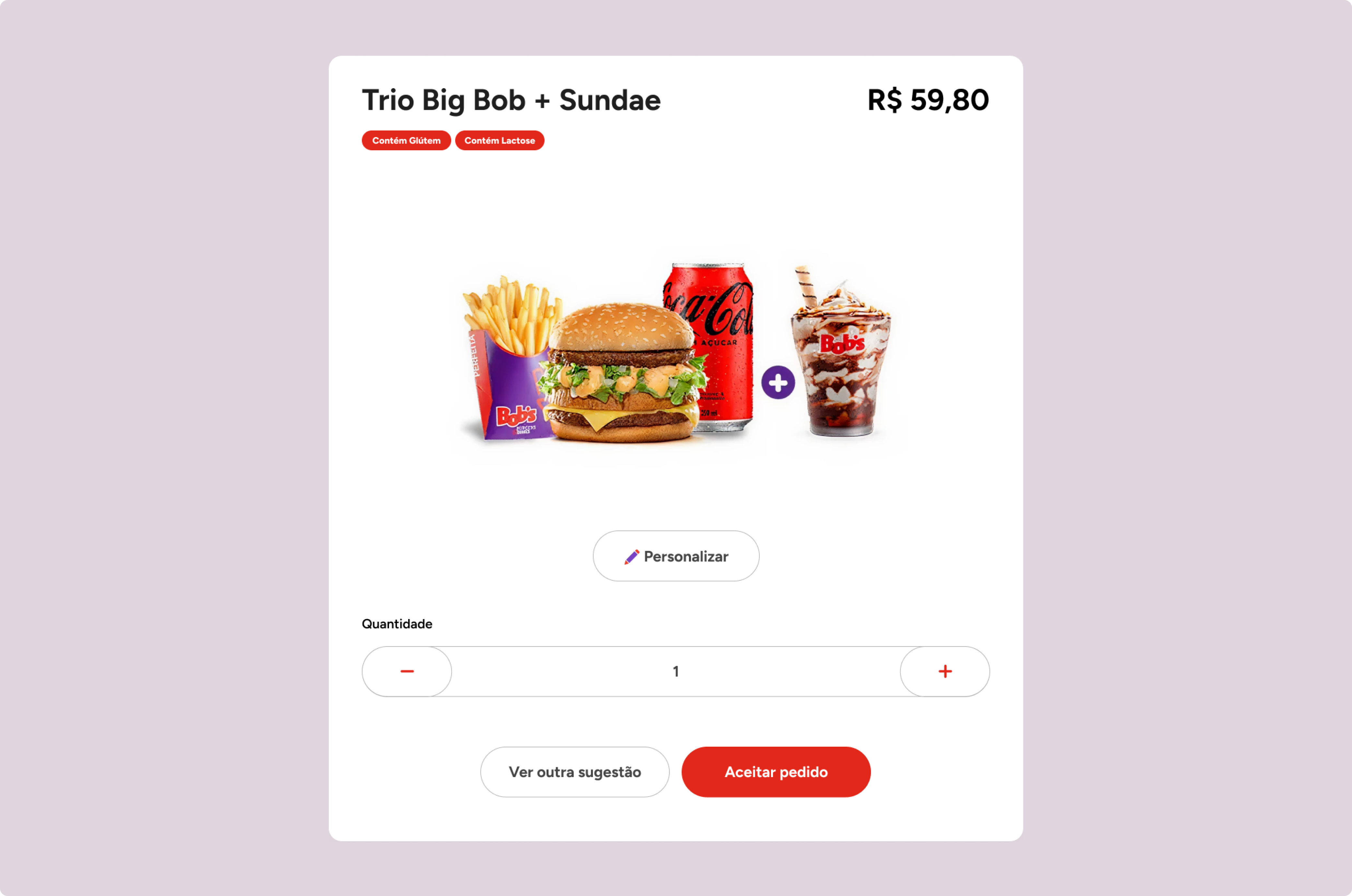
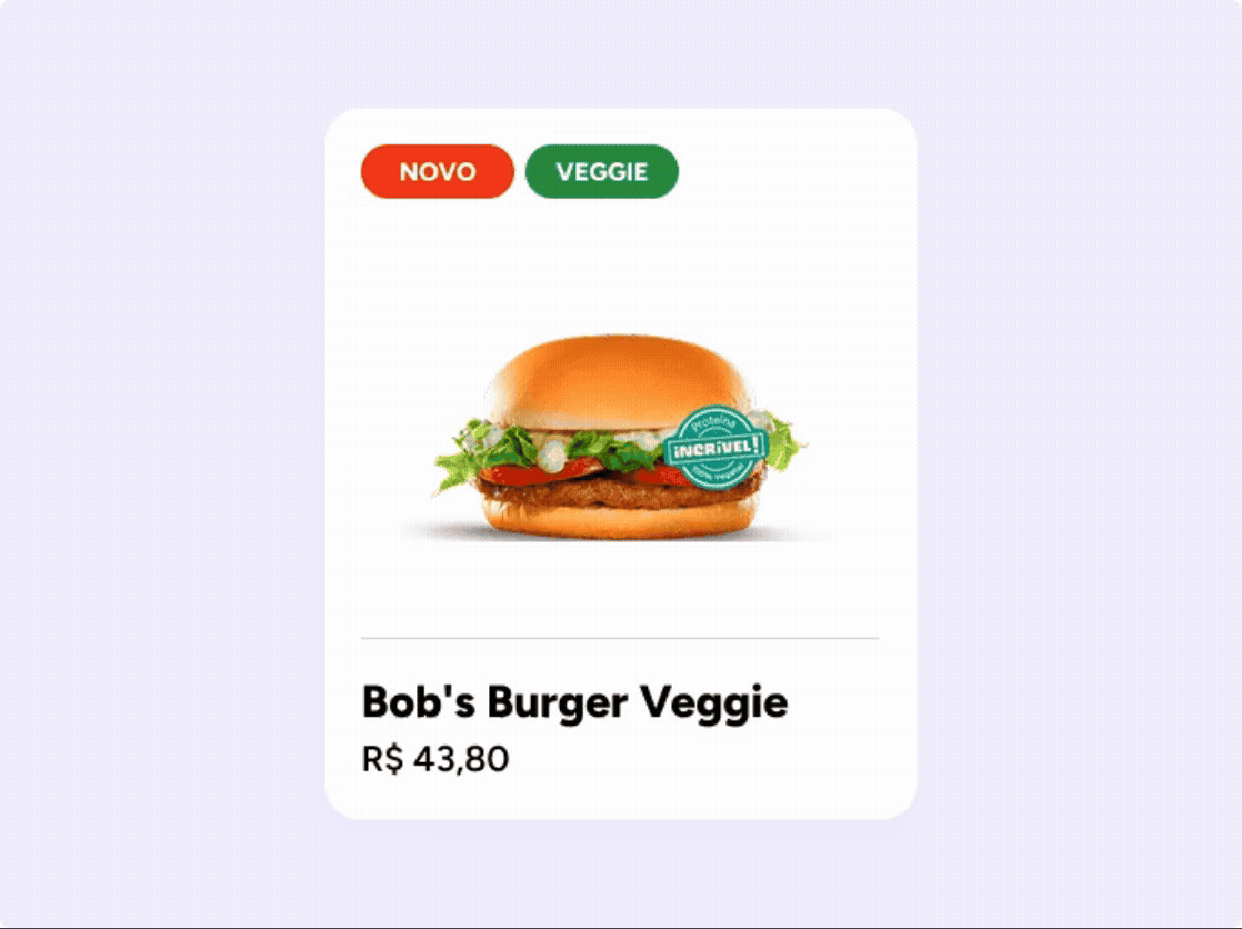
The interface is built around clarity and flow. Each screen helps the user move forward quickly, with a clear hierarchy and simple actions. Rather than exposing the entire menu at once, the experience highlights what matters in each moment.
Some features were created to shift how decisions happen.
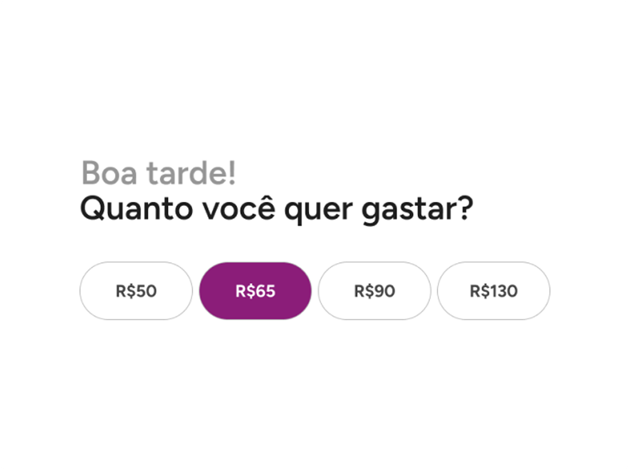
“How much do you want to spend” starts from the user’s budget, showing relevant combinations instantly. It’s a small change, but it makes the process faster and more intuitive, especially for groups.
“Choose for me” removes the need to decide. With one tap, the system suggests a complete order based on popular combinations, making the experience quicker and more effortless.
The interface also adapts to context. During breakfast hours, it prioritizes coffee and lighter options, while still keeping the full menu accessible. This keeps the experience relevant without limiting choice.
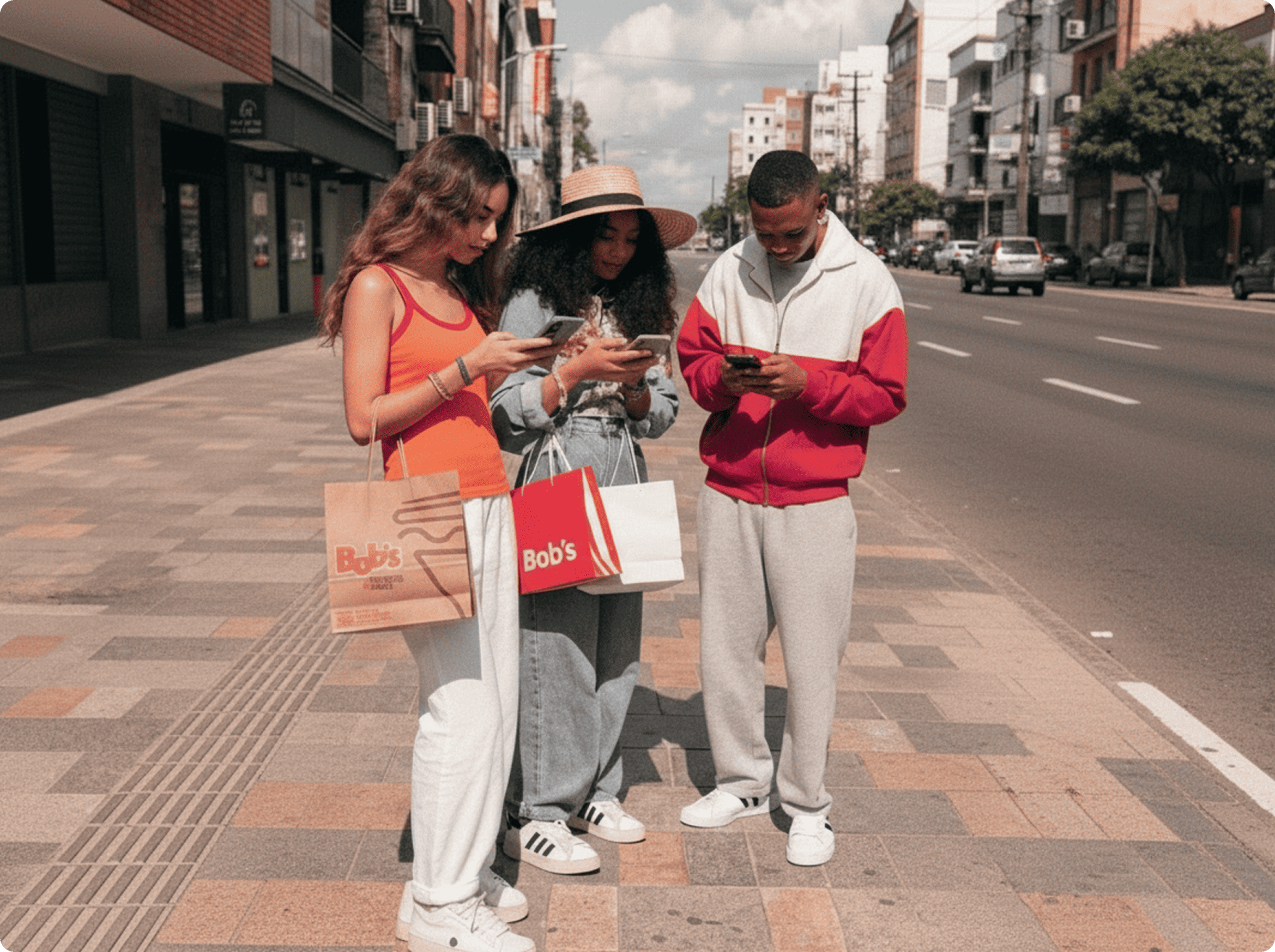
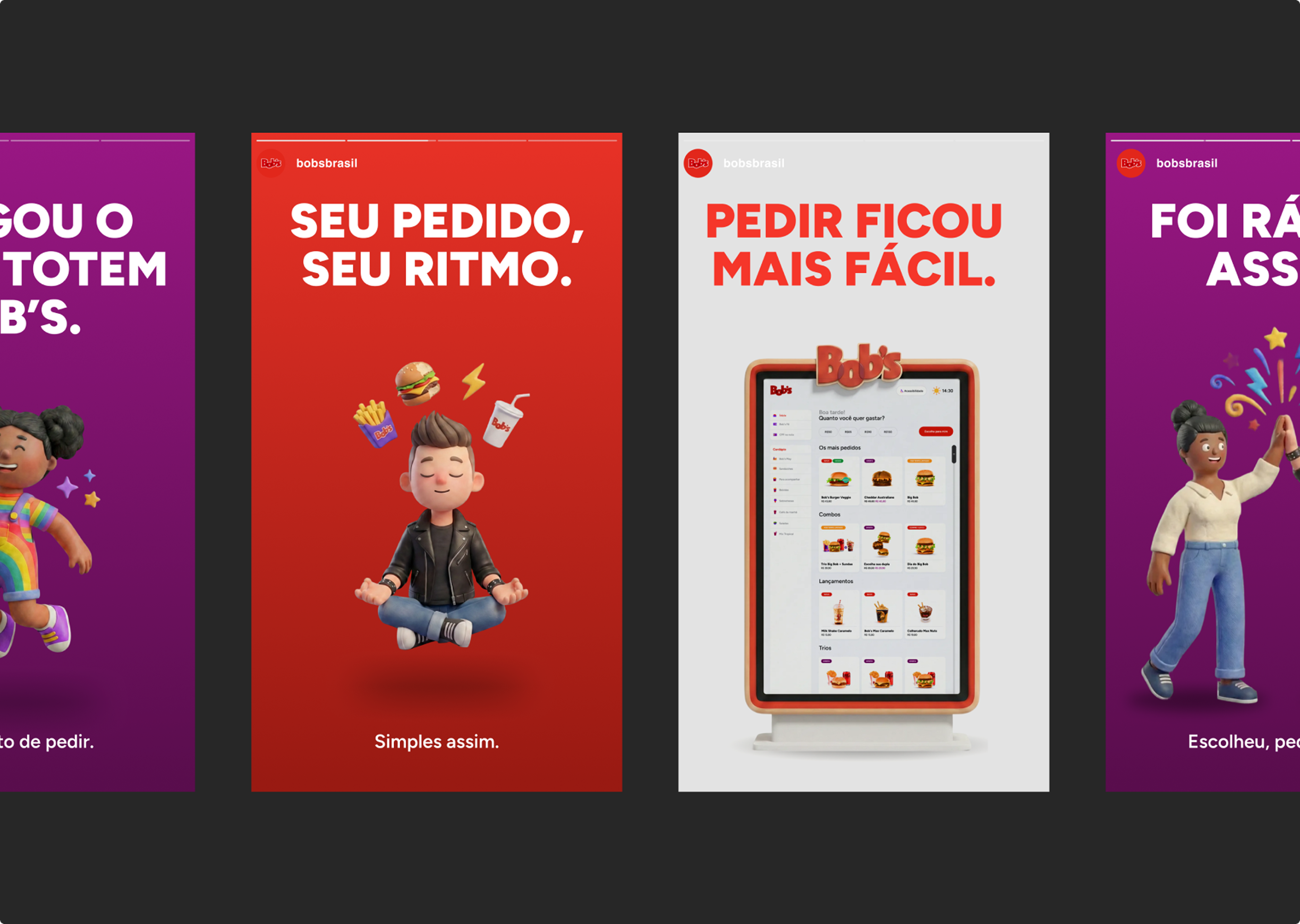
Beyond the product itself, a set of supporting materials was created to bring the concept into real-world scenarios, including totem mockups, street applications, and social media pieces.
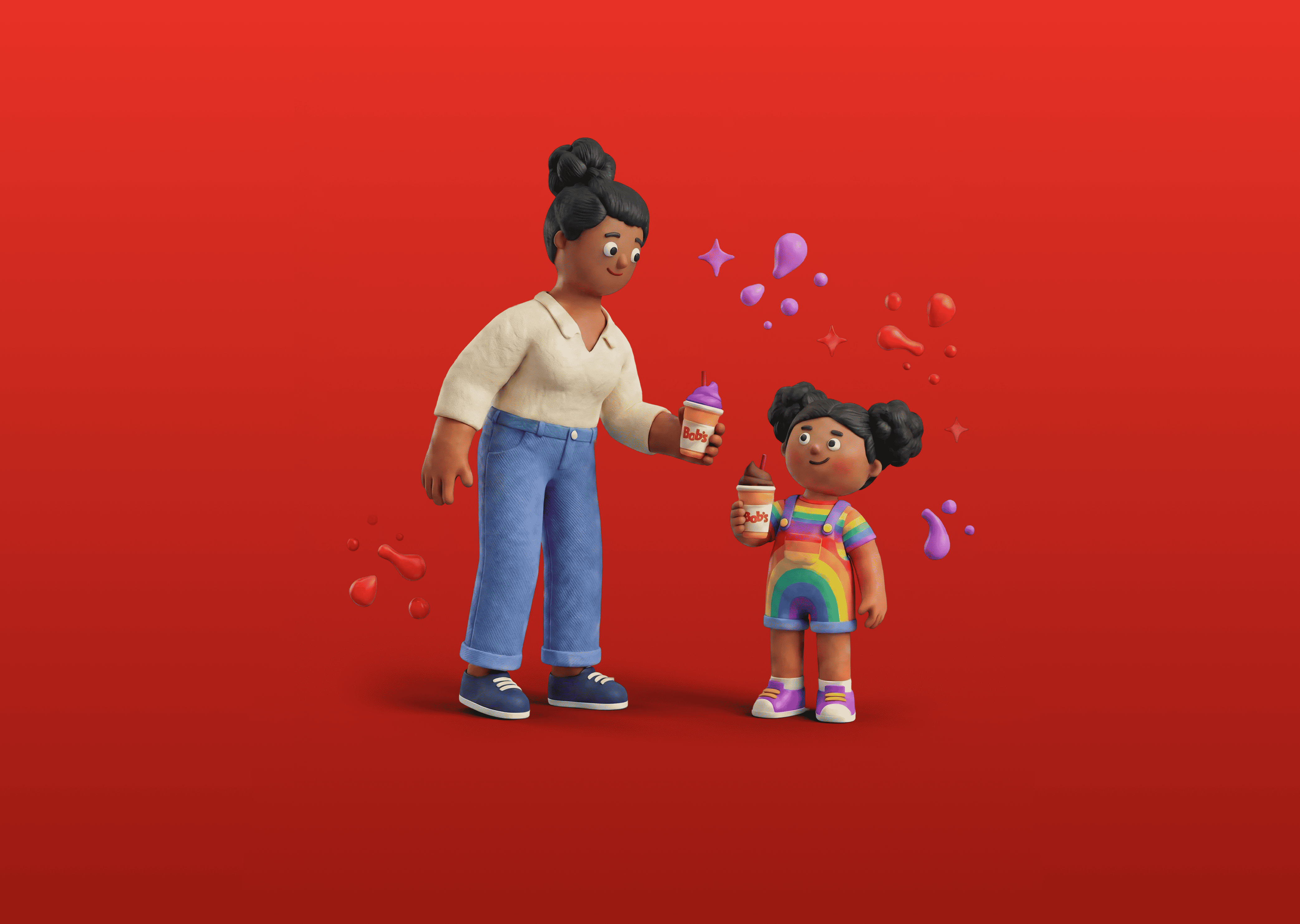
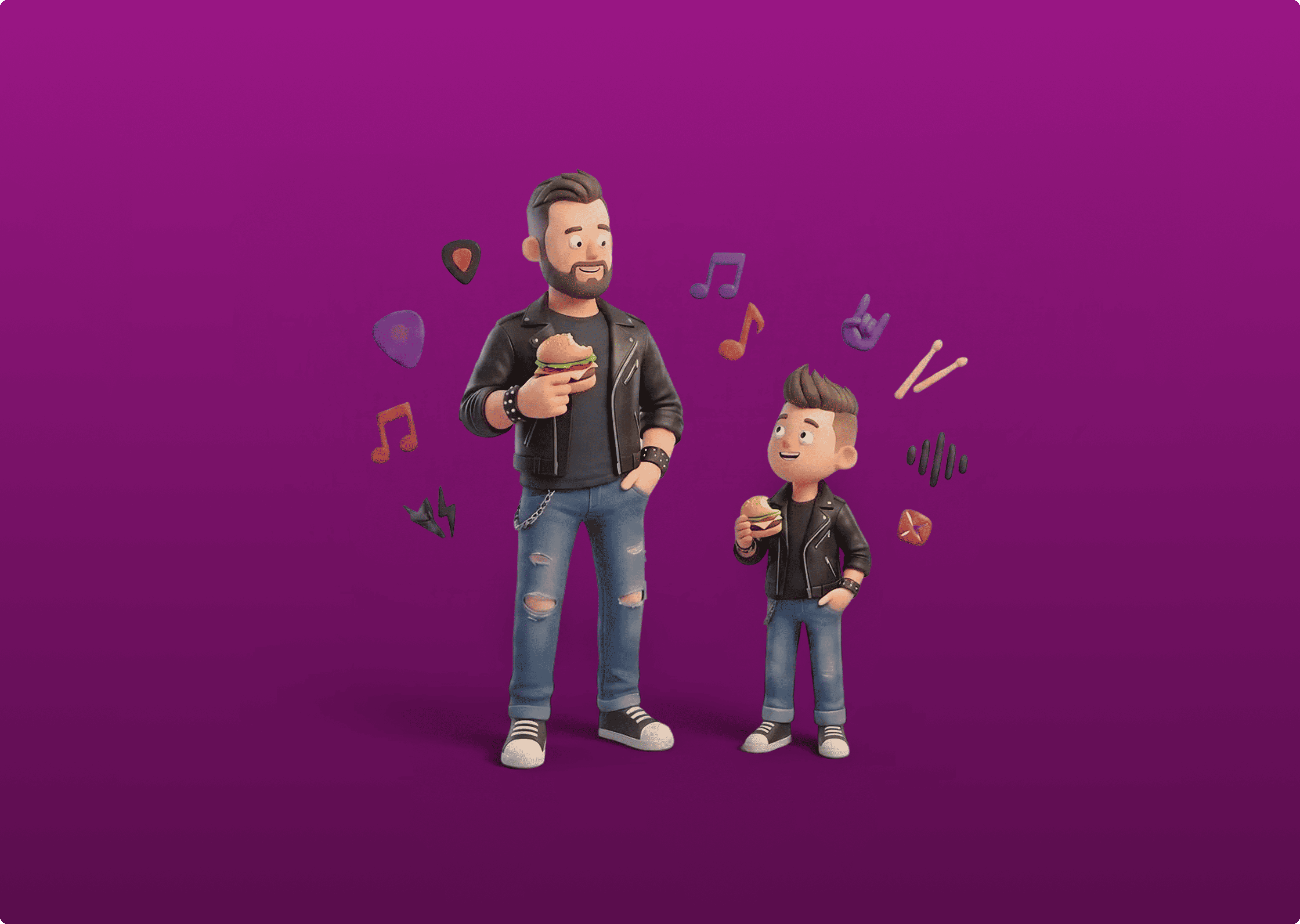
The 3D illustrations were also developed as part of the project, adding a more expressive and human layer to the communication. They represent everyday moments around food and help reinforce the idea of simplicity and connection.
More than a visual exercise, this project explores how digital can better support physical experiences. The result is a faster, more intuitive way to order, aligned with how people actually behave.


%20(1).png)